Hello, and welcome to the second half of my Altenew Educator Level 1 Final Challenge.

In case you missed Part 1, here's the gist:
- Create two card sets, one masculine and one feminine, with 4-6 cards per set
- Cards can be any theme/occasion, but should be a cohesive set
- Use any 3 components (course/skills) developed during Level 1 coursework
- Use one recycled element on one of the sets or in the packaging
Course Components:
Just as I found with the masculine card set, it was hard to limit my inspiration to only three course components. Here's where I was inspired:
- Irresistible Inking Techniques:
- Heat embossing
- Washi tape borders
- All About Layering 4:
- Ombré watercolor backgrounds
- Easy Ink Blending Techniques:
- Emboss resist with ink blending
- Clean & Simple Boutique Cards:
- Heat embossing metallic images
- Luxury papers
- Matching envelopes
- Packaging sets with ribbon
- Easy Die Cutting Techniques:
- Embossing on vellum
- Die cut inlay / eclipse technique
- Let it Shine:
- Embellishment triangles
- Offset shadow layers behind sentiment
- Metallic card stocks
- More embossing on vellum
- Copic coloring the back of vellum
- Stitching on vellum
- Celebration: Stencil Techniques:
- Ink smooshing with stencils
The Plan:
Now, I did sketch out some design ideas for this feminine card set, but then I ran in the other direction and barely looked back. Several of my sketch ideas involved fussy cutting the bamboo roses (since I don't own the dies), and I just didn't want to. You'll have that. In the end, I still had plenty of ideas without referring to my original sketches.

My Design Inspiration:
My real name is Grammy. And I have a second grand on the way this fall. A sweet baby girl. Her nursery is already decorated in shades of peachy-pink, with metallic gold accents. So the color scheme for this project was non-negotiable.
And my baby girl does not need boardroom pinstripes.
When I looked through all my floral stamp options, this was the only set that didn't scream old lady. Because, even though I am a grammy, I wanted these cards to whisper oh, sweet baby girl, we love you already.
And so, I chose Bamboo Roses for their playful, whimsical -- maybe even a little childlike -- design.
For each card, I kept with that floral element and the cohesive color scheme, but I also was sure to incorporate some clean, bright white as a pop of non color. Is that even a thing?
Products:
- Altenew Bamboo Rose stamp set
- Altenew Fancy Thanks die
- Altenew Mega Hello die
- Altenew Beach Towel Stripes stencil
- Altenew Bold Bouquet stamp & die bundle -- you & happy, & tiny sub-sentiments
- Altenew Simple Flowers -- you make me happy sentiment
- Altenew Leaf Canopy -- stay awesome my friend sentiment
- Hero Arts Nesting Rectangle dies
- Gina K Innocent Pink ink
- Gina K Peach Bellini ink
- Versamark ink
- Tombow markers: 817, 873, 192
- Zig Clean Color Real Brush Pens: No. 028 Pale Pink
- Copic markers: RV32, YR02, YG63
- Nuvo Classic Gold embossing powder (retired?)
- Frayed Chiffon Ribbon
- Pinkfresh Studio Metallic Pearls in Matte Gold
- Neenah Classic Crest Solar White in 80# & 110#
- Spellbinders Brushed Gold card stock
- Gina K Innocent Pink card stock
- Judikins Embossable Window Plastic
- Canson XL Cold Press 140# Watercolor Paper
- Vellum (from stash)
- Fun Foam
- Bearly Art Glue
- Shaker Bits:
- Gina K Sequins (Crop & Create Delivered March 2023 Exclusive)
- Spellbinders Gold Smooth Discs
- Spellbinders Ivory-ish Confetti (Advent Calendar 2022)
- Gina K Disco Ball Sequins
- Gold Washi tape (from stash)
Pink Hello:
For all the cards in this set, I used all the flower stamps in the Bamboo Rose set. At first, I thought I might rearrange the stamp layout for each card, but then that seemed like a silly way to mix things up. Instead, I created interest and variety in other ways, and just kept with the same flower layout.
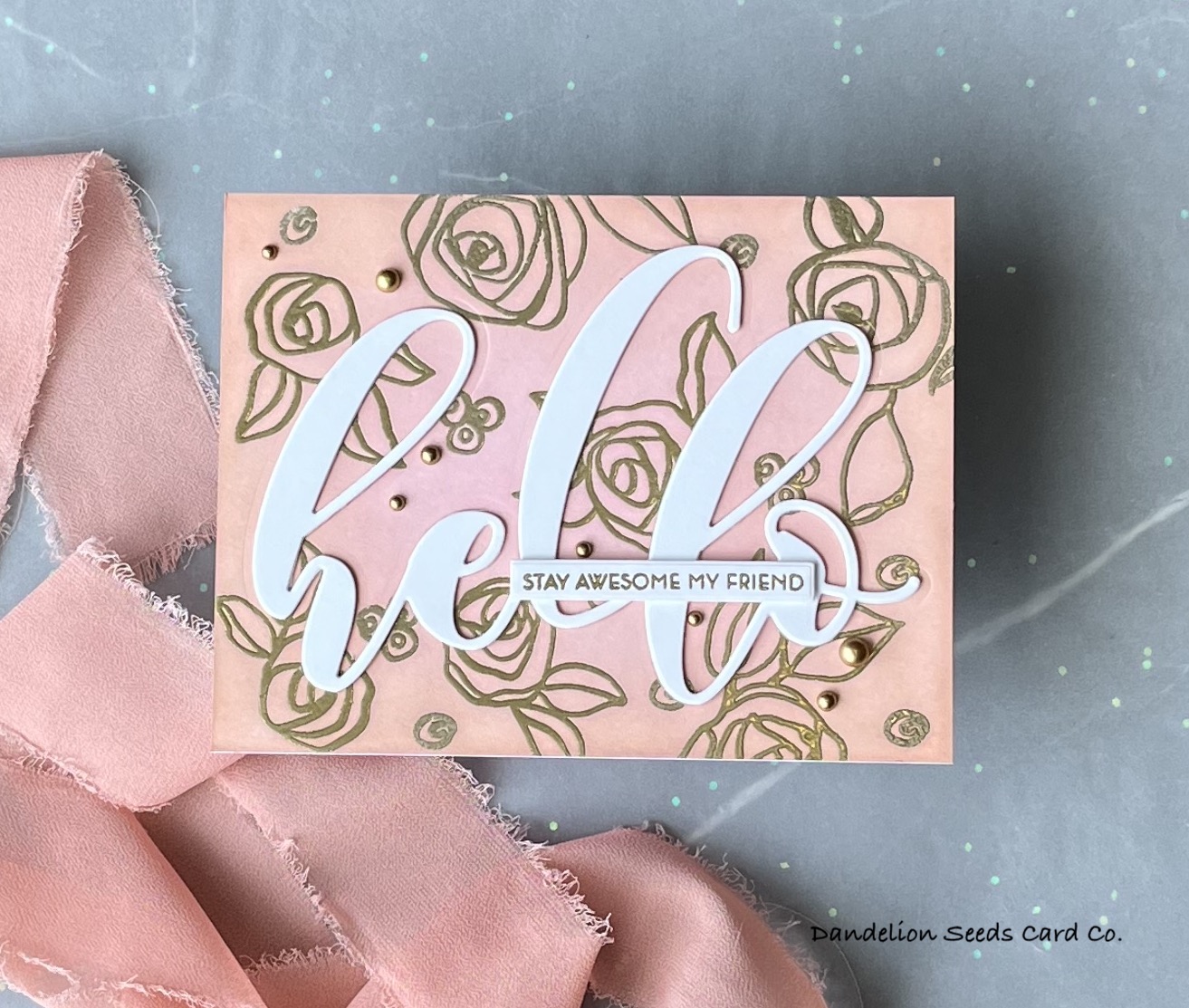
On a white A2 panel, I stamped the flowers in Versamark ink and heat embossed in gold. (Don't forget the anti-static powder tool!) I stamped the tiny flower buds randomly to fill in the gaps in the flower patten. I heat set those in gold powder, too.
Tip: Use a coffee filter to catch the excess powder. That makes a quick funnel to return the excess powder to the jar.
Then, I used an embossed resist technique, and blended Peach Bellini ink around the outer edge of the panel and Innocent Pink toward the inside, being sure to overlap the colors.

Tip: Be sure to not lose the centers of the letters, of the e, l, and o. (These are called the counters.) You'll need them later!
I die cut this same hello sentiment from white card stock three times.
To assemble this card, I first glued the pink floral negative space onto a landscape A2 card base. Then, before the glue had time to set, I temporarily placed one of the white hello diecuts into the positive space to be sure all the skinny, flexible pieces were in the right spot. If not, I could still wiggle them into place. 

Next, I stacked and inlayed the three white hello die cuts. Then, I could fill in the middle of the e, l, and o with the pink counters that I kept from the original pink die cut.
To finish off this card, I added matte gold pearls on the diagonal, in a series of triangles, in some cases, allowing one pearl to be part of more than one triangle. I also stamped and heat embossed stay awesome my friend, die cut it with a sentiment strip die, and added it on top of the hello die cut.

Tip: A t-ruler is crucial to placement of sentiment strips! If you don't own one, you need one. It is seriously the most-used item in my craft room!
And I just love how that white pops on the somewhat busy background!
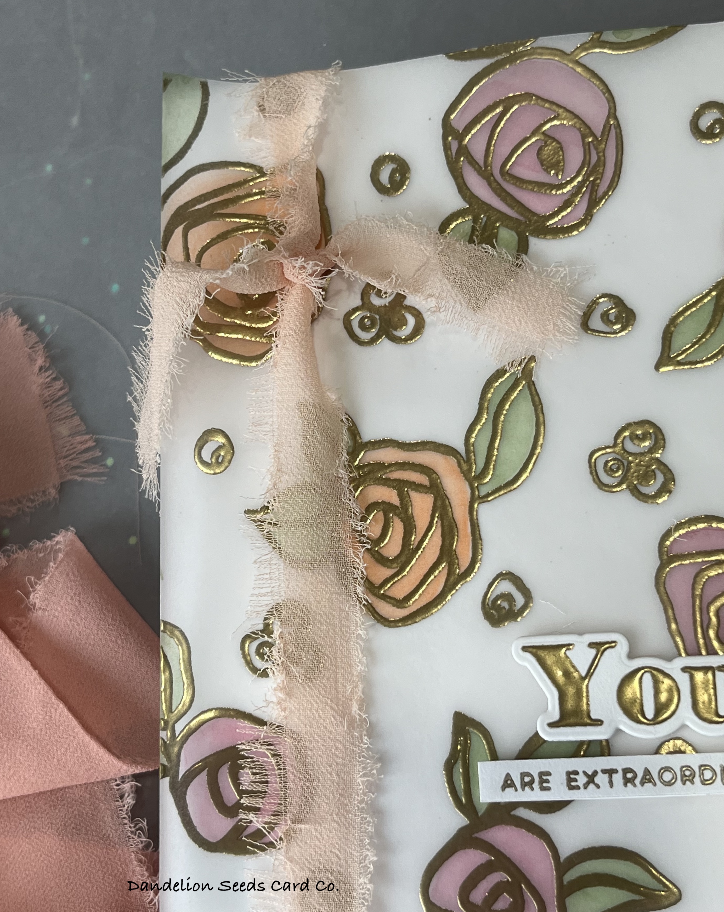
Watercolor Thanks:
This card is so sweet, and it just might be my favorite of the set.

For the floral background, I stamped and heat embossed that same bamboo rose layout onto watercolor paper. I also stamped and heat embossed tiny flower buds into the open space in the floral design.
Tip: Heat embossing creates little walls that help contain color for watercoloring. This is a fantastic option for newbie watercolorists -- and others who don't want to risk a goof up!

To watercolor these flowers, I used Tombow markers and Zig pens. These watercolor markers are so much easier to control than traditional watercolor paints in pans. First, I colored with the markers in the areas where I wanted darker shadow. For the most part, this would be wherever two shapes overlap or touch. Then, I used a waterbrush to wet the marker and get the color flowing throughout the petal, but within the walls.
When the panel was dry, I cut it on the diagonal, and then did something that may seem unnecessary: I replaced the area I'd cut off with vellum. Even though vellum is mostly white and fairly see-through, there's something about the way it softens the look that is simply beautiful. I also added a stripe of gold washi tape to the edge of the watercolor panel. 

For the sentiment, I die cut thanks twice -- once from gold and once from Innocent Pink. I blended on just a little bit of pink shading to the lower edge of the pink die cut. I stacked these two, offsetting the top one, so the gold shadow peeks out from beneath the pink die cut. I glued this just above the gold washi tape.
Tip: It really helps to place these intricate die cuts onto a sticky mat when you're stacking them! A fine-tip glue bottle is essential to this process!

To glue this panel down to a card base, I added glue behind the watercolor paper. Plus, to keep the vellum from completely flopping around, I added glue to the vellum exactly behind the thanks die cut. This keeps any glue dots hidden. I adhered this down to a white A2 top-folding card base.
I finished up this card with an odd number of matte gold pearls, positioned on the diagonal around the sentiment.
Stitched Vellum Thanks:
I just bought a brand new sewing machine! And what do I stitch? (That's rhetorical, of course.)

For the background paper, I created a pink-peach ombré panel on watercolor paper using Tombow markers. I simply colored with the markers, pink at the top and peach below, and then spritzed them with water to get the color moving.


Now, I'd like to say I let nature (physics?) take care of itself, but I am not one to leave things alone, so I did help the process along with a wide, flat paintbrush. Then, I dried the panel a bit with my heat tool and set it aside to finish drying.
For the vellum panel, I stamped and heat embossed the bamboo roses onto an A2 piece of vellum. For this panel, I did not add the extra flower buds into the pattern. I just sort of liked the simplicity atop this ombré panel.
Tip: Keep your heat tool moving! Vellum will warp and melt when it gets too hot! Ask me how I know.
When the watercolor panel was dry, I stitched the vellum to the front of the panel, using one zigzag stitch and one straight stitch. For both stitches, I set the stitch width and length to their maximum. I thought that made the design a little more playful.

For the sentiment, I stacked two white thanks die cuts and glued those onto the lower part of the vellum. I finished up this card with an odd number of matte gold pearls, placed in a diagonal line around the sentiment.
Pink Ribbon & Vellum:
This card involved a high-impact technique I'd never tried before: coloring on vellum with alcohol markers!

For this card, I stamped and heat embossed the bamboo roses and buds onto vellum. Using Copic markers, I colored the design on the back of the vellum. This creates such a lovely, soft look!

Tip: Don't bother trying to shade or blend with alcohol markers on vellum. It just doesn't seem to work. Plus, vellum (at least the cheap stuff I buy) can only handle so much alcohol ink before it succumbs to the abuse. Don't push your luck.

I adhered the vellum to a white A2 panel with a single strip of double-sided tape, strategically placed where I knew the ribbon would cover it.
I tied a piece of chiffon ribbon around the panel, and then adhered this to an A2 card base. For a sentiment, I added a heat embossed and die cut you and a sub-sentiment as well. Both of these have additional die cuts stacked behind them for dimension. I decided not to add pearls to this card because I did not want to detract from the pink ribbon.
Shaker Card:
It does not matter how old you are; there is nothing more fun than a shaker card for your birthday!

To create the shaker window, I heat embossed the bamboo rose pattern onto a piece of acetate.
Tip: Just like when embossing vellum it is important to keep your heat tool moving on the acetate. Oh, and if the acetate product doesn't say it's heat safe, it's not.
Ask me how I know.
For this card background, I ink blended peach and pink inks onto an A2 panel, being sure to overlap colors to get a smooth blend. Then, I adhered that panel to a top-folding card base.
To create the shaker sides, I nested two rectangle dies, creating a frame with a 1/2" border all the way around. I cut this twice from fun foam and once from white card stock. (My original plan was a gold frame, which I decided not to use.)

Tip: With a large shaker window, it helps to have some support in the middle of the window, so it doesn't sag. In this case, I cut two happy die cuts from fun foam and stacked them to support the middle of the window.
Preparing the shaker...
I stacked the two fun foam frames, the acetate window, and the white frame, in that order. I used the acetate window upside down so the embossed flowers were on the backside of the window. This softens the shine of the embossed flowers, so the focus can be on the shaker bits and not on the gold embossing.

I adhered the two fun foam happy die cuts to the back side of the acetate window. These are the support to keep the window from squishing.
On a scrap of white paper, I stamped happy in Innocent Pink and stamped and heat embossed a tiny birthday on top of the happy word. I die cut this out and also cut an extra die cut from white paper. I stacked these and adhered them exactly on top of the foam die cuts that are below the acetate window.

I glued several sequins here and there on the background, so even if all the shaker bits were down at the bottom of the window, there would still be some bling on the background.
I sprinkled in a couple teaspoons of shaker bits and then glued the frame on top of the pink panel.

Tip: Let it dry for a long time before you even think about shaking those bits.
For once, you don't have to ask me how I know.
Striped Hello:
I guess with each card set, there should be one card that I almost don't include. This is it.

Earlier, when I watercolored the pink-peach ombré background, I guess I was feeling adventurous, and I created this striped background. I simply smooshed ink onto a stencil, spritzed it with water, and then laid it down across a watercolor panel and left it there.


I don't know what kind of masterpiece I was expecting, but it was fine. Kind of funky and modern. Maybe not sweet, baby girl. But not not sweet baby girl, either. It was one of my card sketch ideas. Nonetheless, I set it aside and went back to the florals.
I had also been shuffling around the hello die cut that was leftover from the Pink Hello card. Could these become one?
It's worth a try.

Well, I did try, but it simply didn't come together. The embossing on the hello just didn't look right against the striped background. They were too unlike, I think.
And then, in some stroke of genius, I realized I could emboss those same flowers onto the striped, watercolor background, and then the flowers on the hello would line up!
And that's what I did.
I stamped and heat embossed the flowers onto the striped background, and then I watercolored the flowers with the same markers I'd used earlier. The stripes did show through the watercoloring a bit, but that didn't seem to distract from the floral image.
While the panel dried, I stacked up two more hello die cuts and added the pink one on top.

Tip: I've found that it helps to use tweezers to stack die cuts and lay down one side of the die cut first, while holding the other end up out of the glue. This gives you time to get one end into position before laying down the whole piece.
I positioned the stacked hello onto the striped panel, being careful to line up the flower pattern. I stamped and heat embossed the you make me happy sub-sentiment, trimmed it out, and layered it on top of the hello.
I added matte gold pearls, but fewer than I'd used on the other hello card. I decided this one had enough going on without a storm of embellishments.
Wrapping It Up:
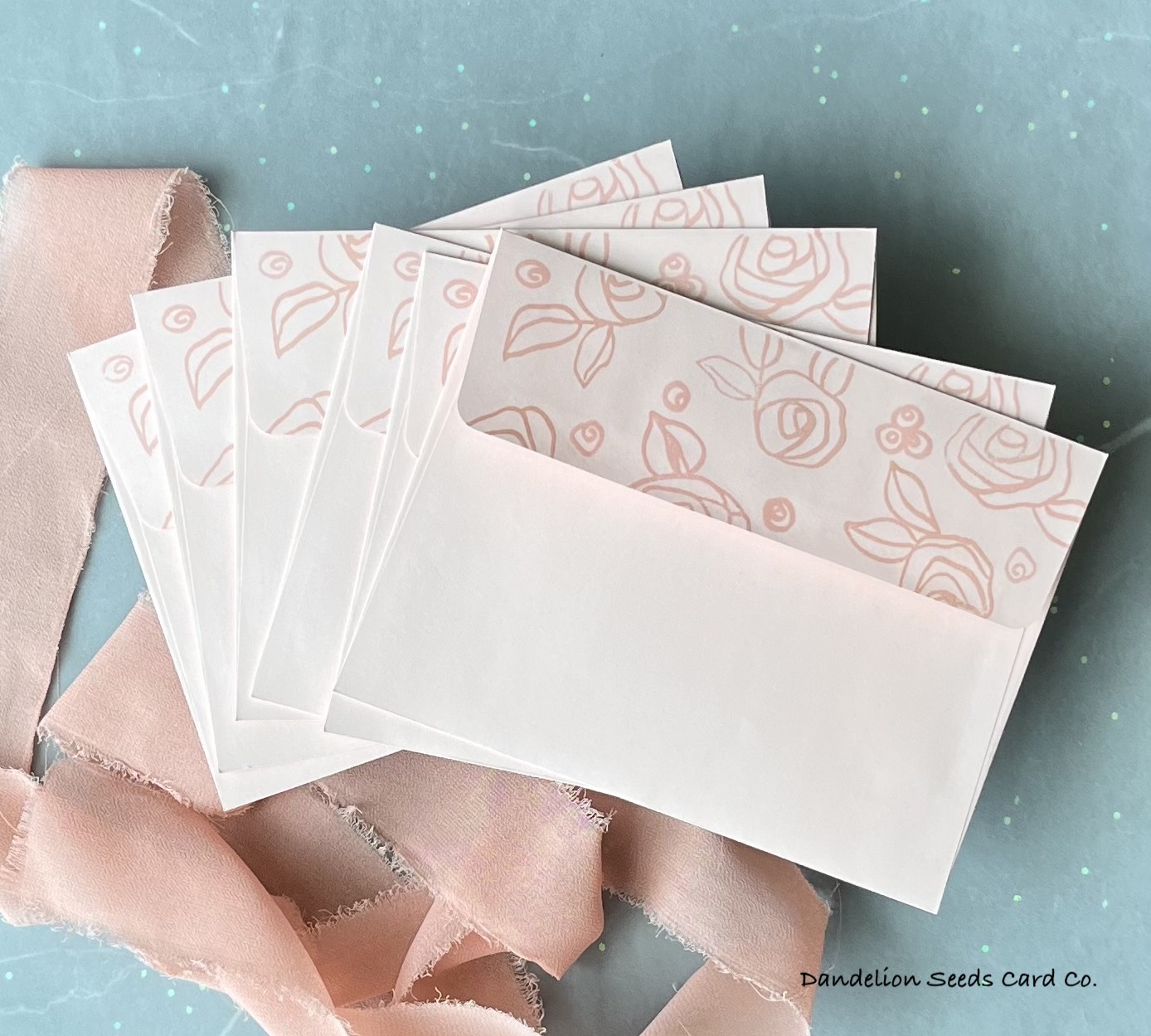
For matching envelopes, I stamped the envelope flaps with a few roses and buds. I used pink envelopes and Innocent Pink ink for a tone-on-tone effect. In the interest of speed, I masked off the main part of the envelope with a piece of acetate that just happened to be the same size as the envelope itself.

In keeping with the delicate sweetness of this set, I wrapped up the cards and envelopes with a length of chiffon ribbon. I tied a tiny bow on the front and left the tails playfully long.
And That's It!
Wow, is this card set different than my masculine set! I honestly thought I'd like this set better because I am normally drawn to florals and softer colors, but I think both are quite nice, and I cannot choose one over the other. What the masculine set boasts in precision and formality, this one contradicts in graceful details and playful designs. Each one unique. Each one lovely in its own right.
Level 1 and this Final Challenge have pushed me outside my comfort zone, empowered me to try new techniques, and encouraged me to experiment with my products beyond my typical one set-one card routine. What an experience it's been!
And now on to the next adventure!
Thanks for stopping by!
Tammy
Tammy
You are SO talented. These cards are absolutely gorgeous! I appreciate you sharing all of the details for making the cards. AND I love your writing style and your sense of humor. Now, excuse me while I check out the rest of your blog. I can't wait to see what else you've created! Btw, I found your blog through your post on the Share Handmade Kindness post on FB.
ReplyDeleteSusie, you have absolutely made my day! Really. It means so much to me that you read my long-winded card story AND that you took the time to provide feedback. I hope you will continue to find my blog relevant and worthwhile!
DeleteAbsolutely gorgeous designs, incredible attentin to details. I found both of your posts very well-written and enjoyable to read. Keep up the excellent work, Tammy. You are super talented!
ReplyDelete