Hello, and welcome to part one of my Altenew Educator Level 1 Final Challenge.
Throughout the ten courses in Level 1, I have practiced techniques in inking, embossing, stamp layering, die cutting, stenciling, and all other things related to card making -- all in preparation for this challenge.

Here's the gist:
- Create two card sets, one masculine and one feminine, with 4-6 cards per set
- Cards can be any theme/occasion, but should be a cohesive set
- Use any 3 components (course/skills) developed during Level 1 coursework
- Use one recycled element on one of the sets or in the packaging
Course Components:
If you know me (and obviously you don't), you know I tend to overdo, overthink, over-everything. So, when you ask me to incorporate three course components, the likelihood my brain can stop thinking at three is slim. Now, I could mention just three, and you'd be none the wiser, but how over-everything is that? And what's the point of copious note taking if you don't use the notes anyway?
So, here's where I drew inspiration for my masculine card set:
- Let It Shine:
- Dark, offset shadowed sentiments
- Metallic threads
- Layering design elements
- Metallic card stocks
- Capitalize on white space
- Clean & Simple Boutique Cards:
- Heat embossing for metallic images
- Luxury papers
- Matching envelopes
- Irresistible Inking Techniques:
- Masking
- Washi tape borders
- Heat embossing
- For the Guys:
- Strong geometric patterns
- Interactive elements
- All About Layering 3:
- Allow some elements to hang off card edge
- Test die cut position to get proper sentiment placement
- All About Layering 4:
- Cut away card front to reveal the inside on the outside
- Design elements in odd numbers
My Design Inspiration:
My masculine card set is completely inspired by the idea of a high rise executive. The hubs and I have been binge watching Suits on Netflix, and one of the main characters is rather obsessed with his $12K suits. Now, I'm not suggesting a high profile attorney needs handmade cards, but if he did, they'd be clean and simple, formal and reserved. They'd radiate class.
Obviously, this is not the sort of guy who dyes his foofy Pomeranian pink and bedazzles her in rhinestones. He is old money, not flashy nouveau riche, and the cards he gives should be an extension of his character. Hence, I've styled his card set in navy blue pinstripes and gold -- just like his designer suits and cufflinks.
The Plan:
I chose to feature the Altenew Pinstripes Stamp Set for its classic design, bold geometric pattern, and masculine vibes.
I am not one to sketch out card designs, and I'm not even a fan of following card sketches. However, since these cards needed to be a cohesive set, I chose to sketch out several creative ways to use one stamp set to get multiple looks. 

Now, let it be said that I did not end up using all these sketches, and a couple were altered during construction. I found that the 6x6" stamp I used was simply too large for my MISTI stamping tool. In some cases, I could not get the angles required by the design. So, I pivoted. (pun intended)
Products:
- Altenew Pinstripes Stamp Set
- Altenew Dainty Swiss Dots for all heat embossed sentiments
- Altenew Fancy Thanks die
- Altenew Leaf Canopy for one inside sentiment
- Spellbinders Ornament Frame (CCD 09/2022 exclusive) for tiny balloon bows
- Honey Bee Celebrate bundle (CCD 03/2022 exclusive) for balloons
- Hero Arts Nesting Circle Infinity Dies
- Gina K In the Navy ink
- Versamark ink
- Gina K In the Navy card stock
- Spellbinders Brushed Gold card stock
- Nuvo Classic Gold embossing powder (discontinued?)
- Neenah Classic Crest Solar White card stock in 110# and 80#
- Uniball Signo Gold Gel Pen
- Bearly Art Glue
- 1/8" ancient gold washi tape
- Gold thread
- Fun foam
Chevron Hello:
This was my first card, and it also proved to be one of the most challenging. Achieving the chevron design required strategic masking and an insane amount of planning.

Using a t-ruler, I divided an A2 panel in half lengthwise. There was no exact science to the chevron shape. I measured 1.25" down on each side and 3.5" down in the center and then drew pencil lines that would indicate the angle for the chevron. I used Gina K Masking Magic to mask below those lines and to mask one side of the panel.
Then, I lined up the pinstripe stamp, being careful to keep the stripes in the stamp parallel with the pencil line I had drawn. This. Was. Excruciating. Half of the battle was simply figuring out how to secure the paper in my stamp positioner and get the stamp at an angle that would allow the MISTI door to close.
Reality check: A regular size MISTI simply cannot easily accommodate a 6x6" stamp turned on its diagonal. There. I said it.
After stamping one half of the chevron, I removed the masks and repositioned them on the other side of the card panel. Correctly lining up the stamp on the other side of the panel was even more crucial. Not only did the pinstripes need to run parallel to my pencil line, but they also needed to exactly intersect in the center to create a perfect V.
Tip: Covering the card panel with a piece of acetate was essential to lining up the stamp. Not only does it protect the panel from an inky stamp, but it also allows you to test out your stamp's position before committing to it on the actual card! Just be sure to clean off the acetate before reusing it.
Ask me how I know.
So much wasted paper today.
Fast forward a couple hours, and it was time to finish up this card. I added two stripes of gold washi tape, keeping them exactly parallel with the last pinstripe on each side of the chevron.
For the sentiment, I cut a white circle and a slightly larger navy blue circle. I stamped hello in Versamark ink on the white circle, and then heat embossed with gold powder. (Don't forget the anti-static powder!) I layered the two circles and then positioned them over the point of the chevron.
Card sketch success!
Cut Away Thanks:
At this point, I was still wearing my rose-colored glasses. (Keep that song on replay. You're welcome.) My classy, executive type would appreciate one-layer cards. I was sure of it. And I was naïve enough to think I could deliver.
As per my sketch, I planned a cut away card front that revealed pinstripes on the inside of the card. After the chevron masking masterpiece, this should have been simple rocket science.

Unfortunately, as I should have learned during the chevron masking masterpiece, only a big-top contortionist could position an opened card base and a 6x6" stamp in a regular size MISTI stamping tool. I wanted these pinstripes to run perfectly horizontal across the card, and since the stripes on the stamp actually run on the diagonal, it was time to give up the one-layer card idea. Sorry, big guy.
Now, don't think for one second I gave up that easily. But, in the interest of time, let's pretend like two hours have elapsed and we've moved on.
I measured 1.25" from the edge of a white A2 panel and drew a pencil line. I then masked off all but that skinny area. Inside my MISTI, I positioned the panel and the stamp, so the pinstripes ran perfectly perpendicular to the long edge. (More about this geometry in the next card.) After stamping in navy ink, I pulled away the mask. This panel would be the inside of my card, so I needed to glue it inside a portrait-oriented card base.
Tip: To make sure the card closes correctly, trim about an 1/8" off the hinge-side of the A2 panel. Then, when it's glued inside, it won't add extra bulk to the fold.
I glued this to the inside of an A2 card base. Then, I cut away 1.25" from the card front, so these stripes would be revealed when the card is closed.

To be sure gold would always be visible, I added two washi tape borders -- one along the cut edge of the card front and one on the inside of the card, along the edge of the pinstripes.
For the sentiment, I followed the exact steps as with the chevron card, only this time, I used a thanks sentiment. Since part of the card front had been cut away, I took advantage of that and let half the sentiment circle hang off the edge. To accomplish this, I temporarily placed the sentiment circle where I wanted it and drew a pencil line on the back side of the larger circle. Then, I only added glue to the left of that pencil line.
Another card sketch win!
Best Wishes Landscape:
Now that I've lowered my standards and accepted card layers as the lifesavers they are, things can run a little more smoothly.
As per my card sketch (see how I did that), my plan was to add pinstripes on the opening edge of the card, with gold detailing and a sentiment above that. However, you'll notice that my original plan was to make a top-folding card. Here, I pivoted and made a landscape card instead.
Look at me going rogue.

Remember, the pinstripes on the stamp run on the diagonal, so stamping non-diagonal stripes over a 5.5" area is a bit of a geometry problem that may or may not have something to do with the hypotenuse of a triangle.
I stamped the diagonal pinstripes, on the diagonal, so they'd run perpendicular to the paper's edge, onto a white A2 card panel, not bothering with any masking since I knew I'd be trimming the panel. Then, I trimmed out a 1.25 x 5.5" strip from the panel.
I added a gold washi border to this skinny strip, and then temporarily adhered it to the opening edge of a landscape card base. This allowed me test the placement for my sentiment before committing.
Once I knew where the sentiment should be, I removed the pinstripe strip. I stamped best wishes in Versamark ink and heat embossed in gold. (Don't forget the anti-static powder!) Finally, I added the pinstripes back onto the card.
And look at all that gorgeous white space!
Balloons:
Now, at this point, I have learned two things. One, the other card sketches I've planned, the ones with the fun angles, simply will not happen. And two, because of all my failed attempts at these fun angles, I have an insane amount of navy pinstriped paper scraps.
Time to use them.

For this card, I wanted an odd number of balloons, each different than the others. I cut two different sized balloons from navy and brushed gold card stock. Then, I cut another small balloon from a pinstriped scrap, being sure to keep the pinstripes running perfectly horizontal across the balloon.
On the navy balloon, I stamped just for you in Versamark ink and then heat embossed with gold powder.
To help the balloons lay nicely when overlapped, I layered up additional die cuts to the back of some. The gold balloon is adhered flat down to the card base, and the navy balloon has one additional die cut behind it.

Tip: Draw the balloon lines in stages. Position one balloon and draw its line. Then continue on to the next balloon in the bunch. I drew the ballon lines with gold gel pen.
For the pinstriped balloon, I cut three additional die cuts. Two of these were needed to match the height of the navy balloon, and one of these gives a layer of dimension above the navy balloon.
First, I glued together two of the extra die cuts and held them in place where I planned to glue them.

Then, I roughly drew the shape of the navy balloon onto the die cuts. I cut out this shape.

To assemble this third balloon, I nestled the trimmed die cuts next to the navy balloon and glued those in place. Then, I added one more whole die cut and the pinstriped balloon on top.

I hesitated on the tiny balloon bows, but in the end, I decided even a high-powered executive could handle a little cuteness on his cards.
Interactive Awesomeness:
Remember all those pinstriped scraps?

For this card, I used the same two circles I've used throughout the card set, cutting one from leftover pinstripes and one from navy.
I wanted to add the you're awesome single-line sentiment to the smaller circle, but it was too long. To make it fit on two lines, I masked off half of the sentiment and stamped the other half in Versamark ink. After heat embossing that word, I masked off the other half of the sentiment and stamped the other word.
See the photos below for the two different masking techniques I used.
 |
| Cover part of the stamp with scrap paper and then ink up only the part you want to stamp. |
 |
| Apply masking paper onto card stock, so part of the stamp never touches the card stock. |
| Use a grid transparency to protect your card stock while you line up an inky stamp. Since the circle would move as the interactive element, I glued additional die cuts to the back to make it stronger. Between these die cut layers, I secured the ends of some loopy metallic gold thread. |
To create the slider element, I masked and stamped only the word awesome, vertically along an A2 card panel. To achieve the correct placement, I used the grid lines on my stamping tool. I stamped once and then moved the paper down two grid lines and stamped again. I repeated this until the panel was covered in awesome. I trimmed this panel down to 1.625" x 3.5". To keep the awesome panel in the card, I glued a 0.25" x 2.5" scrap of paper to the bottom edge of the panel.

Working with an A2 card panel, I positioned the sentiment circle where I wanted it to be, and then used a craft knife to cut a skinny rectangle -- just slightly wider than 1.625" -- behind the circle. This would be the opening where the slider panel would pop out. To keep the slider sliding freely, I built up the outer edges of the card with 1" wide strips of fun foam.
To assemble the card, I threaded the slider panel through the rectangle opening and pulled it as far as it would go out the top. Then, I glued the top edge of the awesome slider to the top edge of the sentiment circle. Finally, I glued the entire A2 panel (foam areas only) down to a top-folding card base.
To keep the design going inside, I stamped stay awesome my friend (sans necessary punctuation) inside the card.
Oh, how I wish I had photos of this construction process! Videotaping with my phone seems to have done scary things to its memory, and I'm struggling to retrieve four hours of video footage!
Bonus Script Thanks:
I hesitated to include this card because it has a different font than the rest in the card set, but the color and design scheme are the same, so I decided it belongs in this cohesive set.

I won't trouble you with the details of that pinstriped panel. You know the drill by now, so let's just say I stamped a panel and then trimmed it diagonally at one end. I added a gold washi tape border to the top edge of this panel.

For the thanks sentiment, I added interest by layering a brushed gold die cut on top of a navy blue die cut, offsetting the top layer slightly. Using this darker shadow adds interest and makes the gold one pop off the page a bit.

Tip: I highly recommend glue in a fine-tip bottle for applications like this! Tiny dots of glue are an absolute must on intricate die cuts!

Tip: When stacking or layering intricate or tiny die cuts, it helps to place one down on a sticky mat and then add the other on top. The one on the bottom will hold its shape. And, use tweezers to position the layers! The less you touch the die cuts, the less glue mess you'll make. To remove the die cuts, roll the sticky mat until the die cut pops off.

And that's a wrap!
For each card, I created a coordinating envelope.

Using a scoreboard, I debossed lines onto the envelope flaps. Since the cards are all rather precise, I thought it might be fun to go crazy on the envelope flaps. Therefore, each envelope flap is a little bit different, and the lines are not all evenly spaced. After all, there's more to life than fancy suits and stuffy boardrooms.

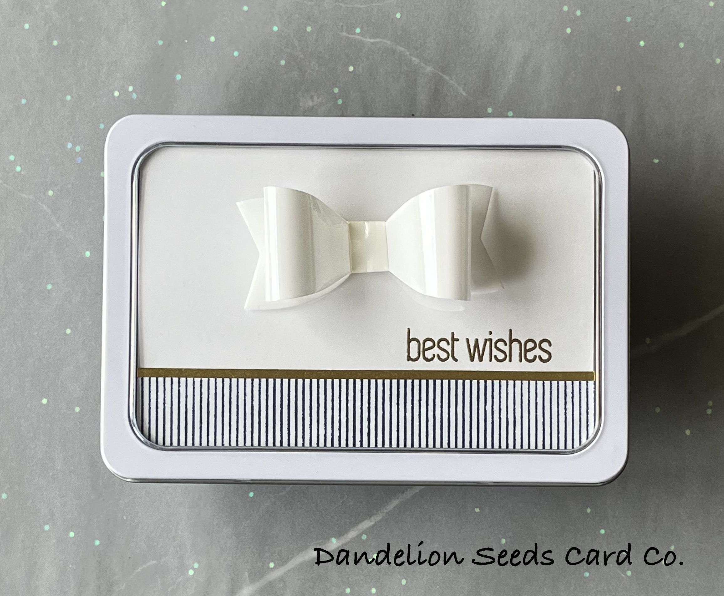
I've packaged this set in a recycled tin from Christmas card tags -- from 2018 apparently -- and topped the gift with a formal white bow tie. 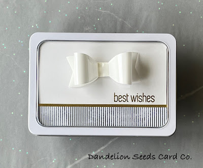
In the End...
I am extremely pleased with this professional-looking, masculine card set. Each card features strong geometric elements and classy gold details all while making the most of white space to keep them clean, simple, and sophisticated.
Thanks for stopping by! Sorry I didn't provide snacks for this adventure.
Tammy
Wow! These are elegant and stunning. Thank you sharing such a detailed tutorial.
ReplyDeleteYou're welcome! I'm glad you enjoyed this long post; not many would have even made it to the end. :)
DeleteTammy, these are my favourite cards ever. I love clean looking cards and this set is just incredible! LOVE the layouts too!
ReplyDeleteThank you so very much! I'm so pleased that you like them!
Delete