Hello, and welcome to another Color Match Monday!
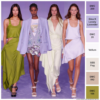
With last week's colors, I went BOLD, so this week, I decided to look toward soft and dreamy colors for inspiration. I found that inspiration in this photo taken by @brandonmaxwell for @voguerunway and shared by @colorstoriesbystacia.
Now, if you know me at all, you know that fashion is the absolute furthest thing from my mind. Nothing, and I mean nothing, is closer to the bottom of the list of things I care about. Irregardless (don't you just love misusing that word!), I was drawn to the pretty lavender and olive colors in this runway photo.
A Design with Movement:
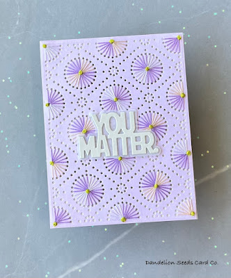
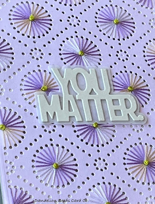
I've used the Spellbinders Circular Stitch Background many, many times on cards, so this time I wanted to step things up a bit. I had the idea I could create movement in the design by using two colors on each circle, and rotating these colors around the circles. Here's a horrible mock-up of what I mean by this:
Despite my inability to effectively draw this concept, I think I pulled it off.
Balancing Colors:
The other change I thought might help create movement was to use the colors in unequal yet proportionate amounts.
The Sentiment:
To not detract from the stitching, I used Simon Says Stamp Fog Gray cardstock for the sentiment and layered it onto its shadow in vellum. The Simon Says Stamp You Matter die cut fit perfectly between the French knots, which helped the sentiment lay flat. I used a Fog Gray card base, too, and just a bit of this peeks out through the holes in the diecut.
And there you have it: A simple, beautiful card inspired by something I find completely irrelevant and mostly blah.
So, the next time you're color shopping, don't forget to look toward the thing that appeals to you least, whether it be bugs, vegetables, or cleaning supplies. You might be surprised at the inspiration you find there.
Thanks for stopping by!
Tammy
Tammy


Comments
Post a Comment