Hello, and welcome to, what I hope to be, the first of many Color Match Mondays! (Yeah, I made that up!)
I recently happened upon @colorstoriesbystacia on Instagram, and it got me to wondering if color combinations in nature and other forms of art really do offer foolproof color recipes for card making. So, I figured I'd give it a go.
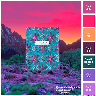
The Color Story Inspiration:
Each color story is based on a photograph, and the colors that make up the photo are shown along the right side. I match up these colors to DMC thread or card stock, and these products become the basis for my card.
Now, don't think for one second this is quick and easy! With 500 DMC floss colors to choose from, it can take me an hour (at least) to choose the closest colors. This often also involves a trip to the craft store, where I purchase 25 shades of one color, only to bring them home and find out that the "close enough" color I already owned is better than all the new ones I bought.
The Card Journey:
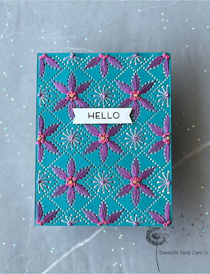
This card should have been your basic three-step project: die cut a panel, stitch it up, add a sentiment. Done ✅. I, however, managed to turn it into a ten-step process that involved three visits to three separate craft stores.
After matching up the colors as best I could, I, naturally, needed a trip to the craft store to buy floss. I now own at least a dozen shades of purple, and I'm set for any variety of pumpkin you could grow. And there you have craft store trip #1.
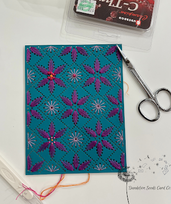
I cut the Spellbinders Stitched Petal Diamond Background from Gina K Tranquil Teal card stock. And then, drawing inspiration from the photo colors, stitched the large flowers (DMC 33) and the mid-size starburst designs (DMC 3836). I was loving the purple and teal color combo! I was not loving the stitched flower center, though. I'd recently admired beadwork on stitched cards, so I decided to use orange, pink, and purple beads in the centers of the flowers. And here's where things turned south.
Craft store trip #2:
I swung by another craft store and purchased size 8 glass beads to match the remaining three colors in the story and then stitched up one of the flower centers. That makes it sound like I just whipped this up, but au contraire. My regular embroidery needle would not fit through the hole in the size 8 beads, so I hunted down a smaller needle and then had to hire out the job of actually threading the darn thing.
The results were fun and funky and maybe a bit errr...obnoxious.
Craft store trip #3:
I decided the problem was too-large beads. Luckily, I had been stitching in the car on a long road trip, so I Googled up the closest Hobby Lobby, and we detoured there. I purchased the same three bead colors in size 11.
A smaller bead meant a smaller needle, and I gotta tell you, I can't even see the hole in this one. After a few minutes of blindly stabbing my needle threader toward this invisible hole, I was back in business! I stitched up another flower center and it was better. But still underwhelming.
The Solution:
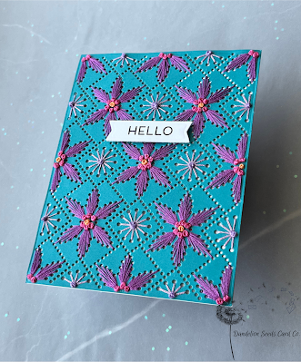
I ditched the beads and went back to using thread only. This was a win on all counts. French knots are impressive. They create gorgeous texture. And I could go back to my regular needle, the one I can actually see to thread.
Tip: I normally stitch with two strands of DMC floss, but the holes in this particular design seem rather large, so I used three strands, so the French knots didn't pull through to the back.
Now, after all this, I was not about to cover up the stitching with a big sentiment. So, I cut a tiny banner from the Technique Tuesday Best Words die set and stamped a sentiment from the Taylored Expressions Sentiment Staples set.
The Verdict?
I think YES! Color stories from nature and other art forms DO provide a foolproof color recipe for card making! I will definitely continue to explore this color inspiration in my card making and share the results here on Color Match Mondays!
 |
| photo credit: @colorstoriesbystacia & @lilmisch |
I hope this inspires you to seek out color inspiration -- whether from an online source like @colorstoriesbystacia or from your own adventures in the world beyond your craft room!
Thanks for stopping by!
Tammy
Tammy


Comments
Post a Comment