Hello, and welcome to another Color Match Monday!
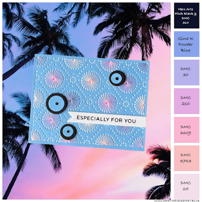
I so enjoyed the dreamy colors I used last week, but honestly, and this might sound weird, I have been missing pink in my life. Weird, right? Anyhow, I was determined to find one of @colorstoriesbystacia's color combos that would give me a heavy dose of pink.
I stumbled upon this photo by @jordanfmcqueen via @rareform in Stacia's Color Stories, and even though I'm not much of a tropical beach lover, I couldn't resist the pinky-peachy-purpley colors. Admittedly, I did have a little trouble matching up a couple of the colors to the paper and DMC floss I have on hand, but I got as close as possible. (And I have a list of DMC colors to shop for!)
Stitching:
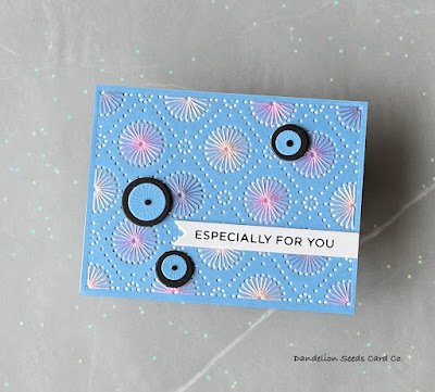
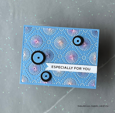
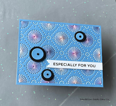
For the background, I die cut an A2 panel of Gina K Powder Blue card stock, using the Spellbinders Circular Stitch Background. This color could have been a little more purpley-blue, but it is what it is.
Using the DMC colors noted in the photo, I stitched 3-4 circles with each of the remaining five lighter colors. I tried to not have any colors be directly next to a matching color. That doesn't always work out, but this time I got lucky and it did! I always use two strands of floss. I know some card makers use more than two strands, but I find the results are a bit bulky and looser with more than two strands.
And a Lesson Learned...
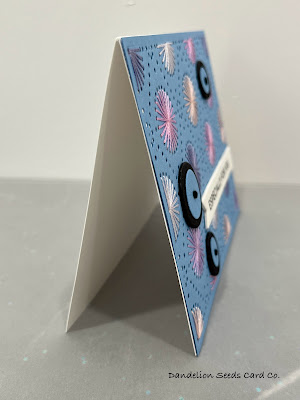
When the circles were all stitched, I adhered the blue panel down to an A2 white card base. And here's where I learned a lesson...
We'll have to back up a pinch for this to make sense.
Normally, when I start a new thread, I just hold the end of that thread in place until I am finished stitching, and then I tie the beginning and ending threads together in a double knot, trim the ends, and stick them down with liquid glue. This way, I know they are secure.
I may or may not have thread trust issues.
However, unbeknownst to me, this technique was the culprit that was creating excessive bulk and making me very frustrated when my panel would not adhere tightly to the card base. Well, if I had just listened to the expert (You know who I mean.), I could have saved myself a lot of frustration.
I have no idea what made me try something different this time, but I did. Instead of tying knots and gluing my thread ends, I simply put a tiny piece of clear tape on the ends. The difference is mind-blowing! The panel is fairly tight to the card base, which never happens when I knot and glue. Now, who knows if the tape will stick for the long run, but it looks great at the moment!
Layering Up:
I love stitching dies, but other than changing up the colors, the design itself can get a bit static. That's where the idea for the black & blue circles came from.
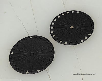
My original idea was to cut additional circles from the design out of black, and then stitch those with one of the thread colors. Believe me, I tried! My closest circle die is just a bit too small for the job. I destroyed a fair amount of paper trying to cut a circle that left enough of a border beyond the stitching holes. It just wasn't meant to be.
Instead, I cut a 1" and two 1/2" circles from Hero Arts Pitch Black cardstock and cut slightly smaller circles cut from Gina K Powder Blue cardstock. I used the same Spellbinders stitching die to texture the blue circles.
To attach the blue and black circles, I stitched a French knot at the center, using three strands of black DMC thread. I stacked up additional black die cuts to add dimension to the circles and positioned them in a triangle just as I would normally do with embellishments.
Finishing Touches:
For the sentiment, I foiled a sentiment from the Spellbinders More Sentiments set, using Spellbinders Opaque Black foil. This was my first time using this particular foil, and it is gorgeous! It's so much more classy than glossy black foil.
I die cut the sentiment with a fishtail banner die from my stash. I cut a couple extras of these and stacked them behind the foiled one for added dimension.
The Result:
It's not perfect. Remember that purpley-blue paper and all the DMC thread on my shopping list? But I do really love the pops of black on the lighter background. And I did get a good dose of pink. And you just can't beat that.
Thanks for stopping by!
Tammy
Tammy


Tammy, I love how this all came about. From the photo with colors, to having your AHA moment, to your extra detail with the black circles. Beautiful card!
ReplyDeleteAngela, thank you so much for your feedback! I appreciate you!
Delete