Shhh...I lied. Yesterday on my blog, I said I only owned two layering stamp sets, but I have since found two more. Now, in my defense they are minis, like 2 x 3" sets that create a single image, but still I confess. I lied.


Even four sets, though, are not many, considering how useful layering stamps are. They can create realistic-looking images, full of shadows and dimension, even if you have no coloring or artistic skill. (This may or may not describe me.)
After completing the Altenew Academy course called All About Layering 3, again, with basically no prior experience in layering stamps, I was a little apprehensive about adventuring into All About Layering 4. I simply didn't know what to expect.
Well, I am pleased to say that the techniques in this class are different but not necessarily advanced, and I found them to be quite manageable. So, woot, woot! I am ready to share my class creations here!
An Apple for the Teacher:

If you are a teacher, and maybe even if you're not, you simply cannot resist anything apple-themed. Now, don't get me wrong, teachers still secretly roll their eyes when they are gifted yet another coffee mug with the overused teachers-touch-lives-forever math equation. But, on their own accord, teachers, by instinct, do a double-take at anything apple-themed.
Which is why I own this tiny Altenew Apple Tree stamp.
The Process:
This clean and simple card came together rather quickly -- if I don't count the amount of time it took me to line up the layering stamp. So much trial and error. Now, a wiser person would have referred to the layering guide. But I'm a teacher who lives and breathes apples, so I figured apple trees were in my blood and, therefore, bypassed the layering guide -- which, by the way, can be found here! Who knew?!

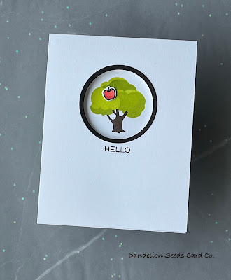
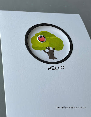
Using two Hero Arts Nesting Circle Infinity dies, I cut a frame from black card stock. I then used the smaller of those dies to cut a hole near the top, center of my card base. I adhered the black circle frame around this hole.
To carry the design from the outside to the inside, I stamped the apple tree on the inside of the card using Gina K Key Lime and Jelly Bean Green inks for the crown and Gina K Charcoal Brown for the trunk. Because no apple tree is complete without an apple, I added a tiny apple die cut from the (retired?) My Favorite Things Lessons in Love set. I used my absolute favorite Copic red combo -- R22 & R24 -- to quickly color the apple, and then added tiny highlights with a white gel pen.

For the sentiment, I searched my stash for a tiny hello in all caps. Lower case letters underneath the circle seemed to look off-center. In the end, I used a sentiment from the Taylored Expressions Sentiment Staples set, stamped in Versafine Onyx Black ink.
And that was it. It doesn't get any cleaner and simpler than this! But I absolutely love this style. And, it has an apple.
Calling the 1970s:

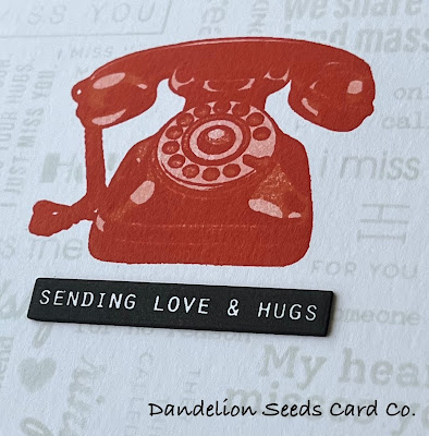
My second card was inspired by an orange wall-mount, rotary dial phone my mother-law kept in her basement (and continued to use) through the early 2000s. When she passed, my husband and I inherited that phone because it was just too cool to let go of.
First, I layered up the (retired?) Altenew It's For You phone near the top, center of an A2 card base, using Gina K Peach Bellini, Coral Reef, and Tomato Soup inks. I used the die from this set to create a mask out of Gina K Masking Magic and positioned this over the stamped image.

For the sentiment background, I pulled out every stamp set I could find with small-ish sentiments themed in hellos and missing yous.
- Altenew Leaf Canopy
- Altenew Pen Sketched Silhouette
- Altenew Bamboo Rose
- Altenew Bold Bouquet (Crop & Create Delivered March 2023 Exclusive)
- Altenew It's For You (retired?)
- Altenew Whimsical Tulip
- Simon Says Stamp Just Miss You
- Simon Says Stamp Miss You Missy
I arranged these on the front of the card base, as close together as they would fit. It helped to use an acetate alignment grid inside my MISTI for this process! I stamped these sentiments with Taylored Expressions Sea Salt ink, which is, by far, the lightest ink color I own. In fact, the sentiments are double or triple stamped -- that's how light this color is!

For the feature sentiment, I used the (retired) Altenew Best Sentiments stamp set. (Here's a similar set.) This is a set that leaves the text white and stamps the negative space around it. After many failed attempts with this stamp set, I finally figured out the trick is to stamp it several times with very little pressure. I die cut the sentiment using a die that just happens to be the right width, and then colored around the edges with my 100 Copic marker to get rid of the white edges. I stacked 2-3 more black die cuts behind the sentiment strip and adhered it beneath the phone.
And that's a wrap!
Clean and simple cards are so visually appealing to me, and using layering stamps creates a heavy impact without being fussy and overdone. I guess that describes me, too.
I hope this inspires you to dig into your stash to find the things you forgot you even own. And then actually create something with them!
Thanks for stopping by!
Tammy
Tammy
Clean, simple and fantabulous!
ReplyDelete