Hello, and welcome to another card share for the Create It 3 Ways Instagram Hop! This hop is hosted by @amritapettus, and it's held on the 3rd Saturday of every month at 3PM ET. Check it out, and if you'd like to participate, just message Amrita on Instagram!
The monthly theme is determined, and each hopper chooses one category to feature on three cards. The theme for August 2023 is sympathy, and I chose to feature Tim Holtz Distress Watercolor Pencils on all three of my cards.
I love how versatile these watercolor pencils are. They are perfect for techniques -- some of which you shouldn't even think about trying with other watercolor pencils.
Wait! Sorry, did I scare you off? It's easy; trust me!
Let's get into the cards...
Technique: Traditional Watercoloring
Despite all the unique uses of Distress Watercolor Pencils, they can be used in the traditional way, too! That's what I did for this card.
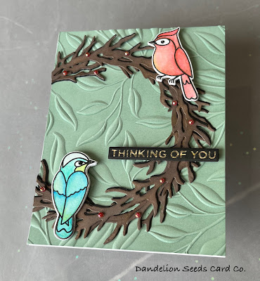
Using Versafine Onyx Black ink, I stamped two of the critters from the Simon Says Stamp Spring Birds set onto Canson 140# Watercolor Paper. I then added clear embossing powder and heat set the images.
For each bird, I added color where I wanted it to be darkest: wherever wings overlapped or where an area would be shadowed by something else. This does not need to be fancy or well done, and the birds do not need to be fully colored. These colors will easily be blended out with a waterbrush, leaving some areas shadowed and other areas highlighted.
For the blue bird:
- Salty Ocean
- Salvaged Patina
- Peeled Paint
- Speckled Egg
For the red bird:
- Fired Brick
- Rusty Hinge
- Mustard Seed
- Speckled Egg
After each bird was colored, I used a waterbrush to wet the color and get it flowing into the un-colored areas. To add more depth of color, you can touch the waterbrush directly to the tip of the colored pencil to pick up more color, and then add deeper shadowing to the image.
Once the birds were dry, I die cut them with the coordinating dies. I cut additional birds from white scrap paper and glued them behind the colored ones for added dimension.
Tip: Moisten the front and back of the paper with a baby wipe before embossing. It helps get a deeper impression and the paper is less likely to crack!
For the wreath, I die cut the Spellbinders Woodland Wreath and Feathered Friends die twice from black card stock and twice from Gina K Warm Cocoa. Onto each brown wreath, I ink blended Gina K Dark Chocolate and Charcoal Brown to add some variation of color. Then, I stacked each brown wreath on top of one black wreath, offsetting them slightly. This created some shadowing behind the brown wreath.
To assemble the card, I stacked the two black/brown wreaths on top of each other, offsetting them to make the wreath appear fuller. Then, I added the birds, providing additional support to the heads since they do not have the wreath under them. I added small pearls from the Glossy Berry Mix from Lucy's Cards, scattering them here and there around the wreath. Disclaimer: That's the end of the traditional use of Distress Watercolor Pencils. The next two techniques are going to result in a messy watercolor look. If that's not for you, run fast in the other direction.
Technique: Watercoloring Line Images
This technique involves coloring directly on a stamp, and that is something I definitely would not try with traditional watercolor pencils.
For this technique, any line image works. I chose the Floral Background 2 stamp from Anthony's Paper Craft. This is a small company that my local store happens to carry. The images are incredibly detailed and so well done!
I colored the image with Picked Raspberry, Peeled Paint, and Salvaged Patina. It helps to moisten the tip of the colored pencil to get the pigment flowing a bit, but even then, the color may not want to stick to the stamp. That's okay! You'll just stamp repeatedly -- which means you definitely want to use a stamp positioning tool. I used a MISTI. Here's the process:
- Color the stamp. That's right. You are coloring on the stamp. Both red rubber and clear stamps will work. You might get better results by angling the colored pencil, so you are coloring with the side rather than the pointed tip.
- Spritz the stamp with a Distress Sprayer a couple times from maybe a foot away
- Stamp the image onto watercolor paper. You'll have to experiment, but I found that letting the stamp sit on the paper for 20 seconds or so helps the color transfer.
- Repeat -- with or without drying in between layers
After the final stamping, dry the panel completely, but do not remove the stamp from your stamp positioner. You'll be left with blobs of color that sort of resemble the actual design. But kinda not really.
To highlight the design, I stamped the image again using Hickory Smoke Distress Ink. This is the perfect shade of gray to outline the image while keeping the messy watercolor look in focus.
At this point, you could leave the image just as it is, but I had areas of messiness I didn't like, so I trimmed it down, using an oval from the Hero Arts Nesting Oval dies. I matted the smaller floral oval with a slightly larger oval made from Simon Says Stamp Fog card stock. For the background, I stamped the same floral image onto white card stock, using Simon Says Stamp Fog ink, and then trimmed it down with one of the Heffy Doodle Stitched Rectangle dies. To assemble the card, I lined up the ovals on top of the background, so the pattern would continue across the layers. I mounted these layers on a Fog-colored card base.
This technique is so forgiving because it's meant to be messy. Honestly, the hardest part of this whole card was lining up the ovals where the pattern would continue from the ovals onto the background.
Technique: No Line Watercolor
Let's just make this clear. I do not have no-line coloring skills. And this technique does not involve no-line coloring as I would traditionally think of it. But I couldn't think of another name to call it, so let's just call it what it is...or isn't...and move on.
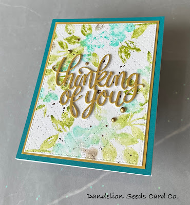
This technique is very similar to the previous one, with the main difference being the type of stamp used. For this type of watercoloring, you'll want to start with a stamp that has large solid areas. I chose the Nature's Glory stamp by Penny Black. The image on this stamp is already loose, and it's made even looser by this coloring technique. I started with an A2 panel of watercolor paper. Then, just as I did with the last technique, I colored on the stamp with the watercolor pencils. This time, I used Peeled Paint, Salvaged Patina, and a little Salty Ocean.
After coloring the stamp, I spritzed it with water and stamped the image onto the watercolor paper. You want this to be loose and messy, so it's okay to go a bit heavy on the spritzing. I repeated this several times until I was happy with the intensity of color.
To achieve this design, I rotated the card stock 180 degrees and repeated the coloring - spritzing - stamping process on the other end of the paper.
The splatters in this design were created with some other Tim Holtz pencil magic -- something else I would never try with any other brand of pencil. For my splatters, I used the Walnut Stain pencil.
Here's the process:
- Dip the end of the watercolor pencil into a cup of water for maybe 10 seconds
- OR You can repeatedly paint the end of the pencil with a wet paintbrush.
- Either way, you'll know you're ready when the tip of the pencil gets soupy. There's just no other way to describe it.
- Then, hold the soupy pencil above your project and use a waterbrush or paintbrush to flick the soup off the end of the pencil and onto your project.
Now, obviously, I highly recommend testing this out on scrap paper first. And it'll be messy, so choose your splatter area wisely.
When the panel was dry, I trimmed it down with one of the Heffy Doodle Stitched Rectangle dies. To add a bit more interest, I dry embossed the panel with the (reitred?) Pierced Plaid Cover die from The Stamp Market. I, honestly, wasn't sure about this added texture, but at this point, there was no turning back.
Using Spellbinders Brushed Gold card stock, I created a mat for the floral panel. To conserve this gold paper, I cut the Hero Arts Stamp and Cut Thinking of You die from the center of the gold mat. I cut three additional sentiment die cuts from white and layered these behind the gold one. To assemble the card, I added an A2 panel of Taylored Expressions Tropical Punch onto a white, top-folding, A2 card base. Then, I layered on the gold matte mat and the floral watercolor panel. I finished up with the gold sentiment and a few Pinkfresh Studio Metallic Pearls in Matte Gold. The Bottom Line?
Tim Holtz Distress Watercolor Pencils belong in your stash. Even if you don't like to color. Even if you don't think you have painting skills. These pencils are all about the techniques. They do things your other coloring mediums probably can't do. And that just makes them fun.
So, try out a set. Just one. Enjoy how these pencils breathe new life into your stamps.
And then run out and buy the other sets.
You know you want to.
You're welcome.
Thanks for stopping by!
Tammy


Comments
Post a Comment