Hello, and welcome to my first card share since graduating to Level 2 in the Altenew Educator Certification Program!
I am pretty excited about these cards. They are clean, simple, modern, and maybe even a little on the funky side. And I just kind of like that.
The Course:
The lessons in this course didn't necessarily include new or different techniques, but the way design is used, its purpose, is unique. Each of the lessons in this class encourages techniques that put the focus on the background while keeping the rest of the card elements rather understated.
So, even though I do appreciate a clean and simple design, I was still forced to look at my supplies with a new eye, as I kept in mind that whatever stamp or die I chose would be the focus of that card. The background would be the focus. Does that make it the foreground? Or is it still the background? Hmmm...
Enough.
Let's get started.
Technique: Stenciled Images
Is it okay if I say I am a little blown away by this card? It's just so organically pretty. I don't even know what that means, but it sounds like the right way to describe this background.
To ink the background leaves, I needed to create a DIY stencil. I die cut the smallest leaf die from the Altenew Leaf Clusters set multiple times into a 5.5 x 6.5" piece of 80# card stock. I concentrated the shapes closer together near the top of the panel and then more spread out at the bottom, suggesting a trailing vine design. Tip: Your DIY stencil should be at least 1" wider and taller than the card panel you'll be inking. A larger stencil leaves room to tape down the edges of the stencil over the card panel. Plus, shapes that are die cut close to the edge of the stencil will actually hang off the smaller A2 panel, and shapes that are completely within a panel hold their shape better than ones cut right on the edge. I used Gina K Light, Medium, and Dark Spruce to create an ombré effect with the leaves, lighter at the bottom and darker at the top. Since the leaf die has a dainty flappy thing in the middle, I used a very light hand so as not to bend the stencil. I heat set this because I wasn't sure if the ink would bleed with the next step.
I wanted to use a black pen to doodle a leaf shape onto each stenciled area. Believe it or not, it's pretty easy to screw this up. So, I practiced. Doodling. Yeah, I know. Don't judge.
Finally, I was brave enough to doodle on the actual project. Using a 0.3 Copic Multiliner, I drew 3-petaled leaf shapes over each inked leaf. And by some miracle, it turned out pretty good!
Tip: Another option would be to stamp a detail line image onto each stenciled area. This stamp set, however, has solid images instead of line images. This particular loose design would also be beautiful drawn with a gold gel pen.
I added a stripe of hexagon-printed gold washi tape along the left side of a top-folding, white, A2 card base, trimmed 1/4" off the left side of the leafy panel, and then glued that panel directly onto the card base.
For the sentiment, I used Versafine Onyx Black ink to stamp a label-style sentiment from the Altenew Best Sentiments set. (I think that one is retired, but this one is the same style.)
Tip: The key to success with these reverse style images is to stamp very lightly. When I add pressure to the door of my MISTI, I press around the stamp but never on top of it.
I trimmed this out with scissors and then colored around the edge with my Copic 100 marker to cover up the white edge of the paper. I stacked several black strips of paper behind the sentiment for added dimension.
Then, the real struggle began. You probably can't tell this from the photo, but it's harder than it looks to wrangle gold metallic thread. That stuff is wiry and stiff and not easy to control. Picture a cartoon character wrapped up in Christmas lights, and that's me trying to manipulate this gold thread into a natural-looking sentiment nest.
I triumphed.
I glued the sentiment strip atop the gold thread, which traps the thread in place, and then added a triangle of Pinkfresh Studio Matte Gold Metallic Pearls.
And, it's just pretty.
Technique: Die Cut Inlay
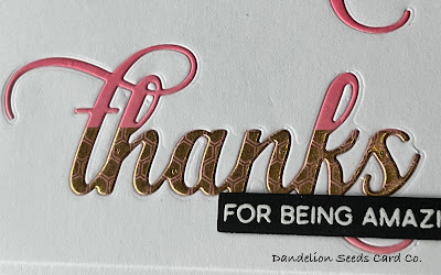
If you've not tried die cut inlay, I highly recommend it. It truly is a technique that leaves a non-card making recipient baffled, wondering how exactly you got the colored design into the white. For this background, the focus is completely on a large sentiment, repeatedly inlaid into the panel. I used the Altenew Fancy Thanks die. Working with a white A2 card panel, I found center by drawing dividing lines horizontally and vertically. This needed to be the center point of one of the thanks die cuts. I cut this one first. That was the easy one.
To place the other two thanks, I drew horizontal lines about 1.5" from the top and bottom of the panel, but then just used those as guides to eyeball the best placement for the other two sentiments. It's tough to get even placement with the swoopy tail on the k. In the end, I think they're close enough to even.
Tip: When die cutting the panel, you can save the white thanks die cuts for another project, but be sure to hold on to the counters in the t, h, a, and k. You'll need those later.
For the colored die cuts, I ink blended Gina K Light, Medium, and Dark Carnation onto white card stock. Then, I added a stripe of gold, hexagon washi tape into each section of color. I placed the thanks die, lining up the bottom of the die with the bottom of the gold washi tape, and then die cut it -- once from each color. Tip: If you have not added washi tape to a die cut, I highly recommend it. It's pretty cool how the die cutting process forces the washi tape onto the paper. It makes it look like specialty card stock -- not like tape at all!
To assemble the card, I trimmed 1/8" off each side of the white panel and then glued it down to a top-folding, white, A2 card base. I glued a pink/gold thanks into each of the three openings, with the darkest one at the top and the lightest one on the bottom. Then, I added in all the white counters that I'd saved from the original die cut panel. Right or wrong, as an afterthought, I added a sub-sentiment. I heat embossed a sentiment from the Altenew Amazing You set, using Hero Arts White Detail Embossing Powder on black card stock. I stacked extra strips of black paper behind this sentiment strip and adhered it to the bottom edge of the panel.
And that's it! No bling necessary.
Technique: Repeated Stamped Pattern
The best thing about this technique is that it works with almost any stamp you have! So just grab anything!
And the worst thing about this technique is that it works with almost any stamp you have! So you will dig through every stamp set you have, trying to find the perfect one.
So, go ahead and pick a stamp.
I'll wait.
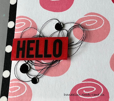
For this background, I chose a flower from the Altenew Simple Flowers Add-On set. It looks remarkably like a cinnamon roll.
At first, I thought I could use my A2 acetate grid placement sheet instead of following the technique as it was demonstrated in class. I was wrong.
To create the grid pattern, I used a plain old ruler to draw very light diagonal pencil lines in a trellis pattern. These can be erased later, after the ink is dry.
Then, I just stamped the image at each intersection in the pattern. I used Gina K Light, Medium, and Dark Carnation inks, concentrating the darker flowers at the top and the lighter flowers at the bottom. After stamping, I heat set the ink and set it aside to dry even more. I did not want to risk smearing the ink with the eraser. To assemble the card, I added a stripe of black and white polkadot washi tape down the left side of a white, top-folding, A2 card base. I trimmed 1/8" off the left and right sides of the cinnamon roll panel, and then foam mounted it onto the card base.
Tip: Bold or geometric patterns will noticeably be off center if they're not precise. That's why, for this background, I trimmed 1/8" off both sides instead of just taking off 1/4" on one side.
For the sentiment, I ink blended Gina K Dark Carnation ink onto a scrap of white card stock, and then stamped the hello sentiment from the Altenew Pinstripes set in black ink. Even though I had not used a sticky ink, I poured on clear embossing powder, and it mostly stuck all over the panel. I heat set from the back, just to be sure the breeze would not blow the powder around. Then, while the powder was still warm, I poured on more embossing powder and heat set again. I repeated this 2-3 times to create an almost plastic-like finish. And then I trimmed out the sentiment and added a few extra scraps of card stock behind it for dimension. To draw the eye to the sentiment, I created a tiny nest of black sewing thread, and then glued the hello on top. This holds the thread in place. I finished it up with a triangle of Spellbinders Smooth Black Discs, also strategically placed to help control the thread.
Such a fun, bold design.
And who doesn't like cinnamon rolls.
And there you have it...
Simple, bold, graphic designs -- reminders that stunning design does not have to be fussy and involved. Relatively speaking, these cards were fairly quick to put together -- even quicker if I don't count the thread wrangling time -- and yet, each is good enough for even my most card-worthy friend.
I need to keep this message on replay: Stop with the fussy card designs and keep it simple.
Maybe you need that message, too.
You're welcome.
Thanks for stopping by!
Tammy


Your cards always blow me away. LOVE your work.
ReplyDeleteThank you so much!
Delete