THIS has got to be one of the most special cards I've ever created! This one's all about the background backstory.

The Inspiration:
When your favorite baby is an artist, you'll create a gallery of sorts to display his best pieces.

But when your favorite baby creates art of the circular variety, you'll need to think outside the box. Or, in this case, outside the frame.

When my daughter offered me this fingerpainted watery masterpiece, I almost didn't take it because it didn't seem framable. But the blues and greens were so pretty, I couldn't resist. After a few weeks of shuffling it around on my kitchen counter, I was inspired to create this shaker card.
The Card Base:
To create a circle-shaped card base, I cut two plain white circles using the largest Hero Arts Nesting Infinity Circle die. I scored one of these 1/4" from the edge. On this one, I stamped a sentiment because I knew I didn't want a sentiment on the front of the shaker card. I added glue -- only on the tiny scored part -- and then glued the two circles together.


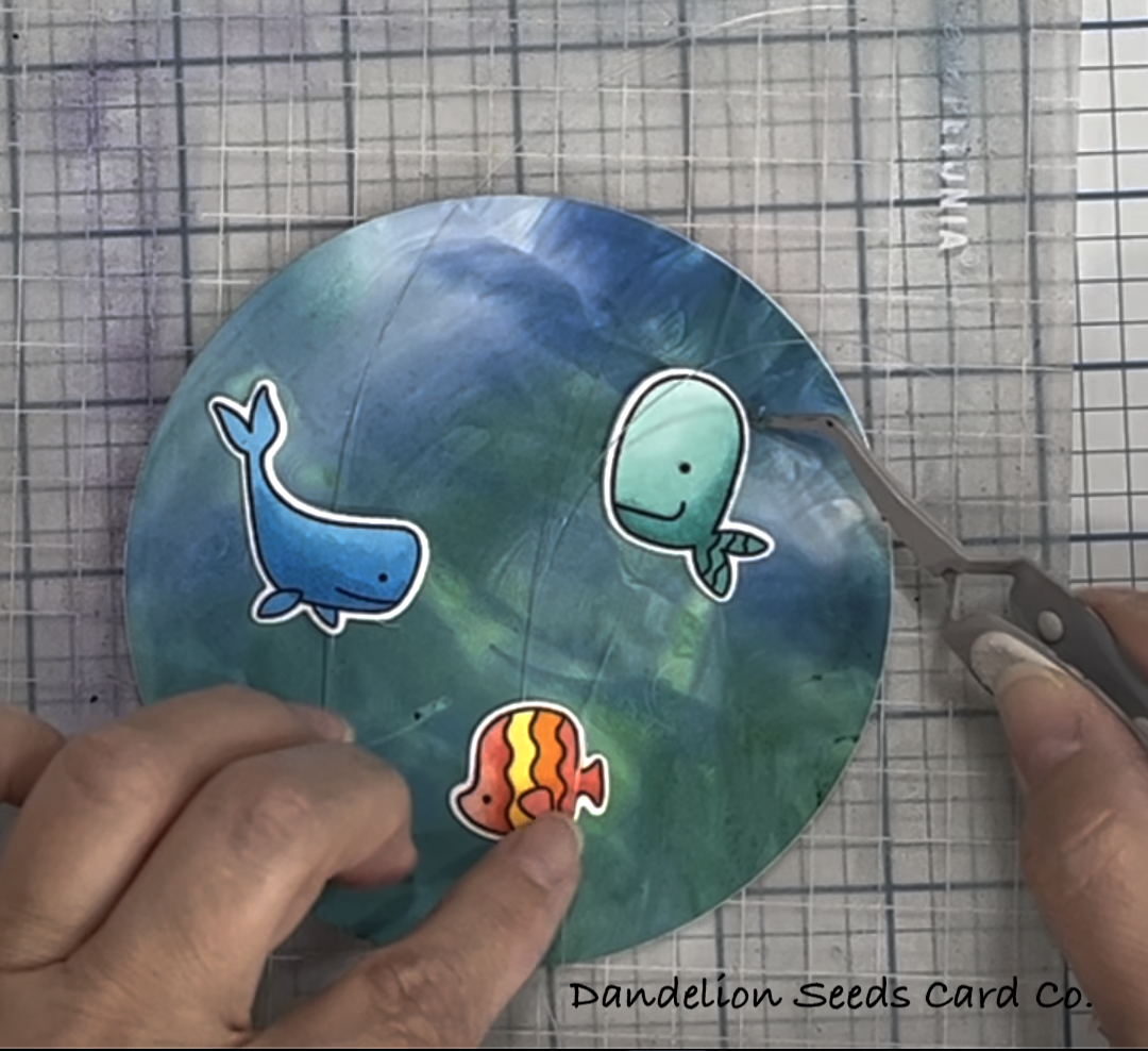
To say I was a little nervous to cut up my baby's art is an understatement. After several minutes of checking and rechecking my design, I die cut it using the largest circle die. I then glued it to the top of the circle card base. I set this aside to dry.
The Fishes:
I probably didn't need this many fish, but they were all so stinking cute I stamped them all. The fish are from the (retired?) My Favorite Things Fish You Were Here set. I colored them with Copic markers and then die cut them out. Here are the markers I used:
- Purple fish (used tail only): BV00, BV01
- Purple whale (used head only): B63, B66
- Green chubby fish: YG11, YG13, YG25
- Blue whale: B02, B04, B05
- Tiny blue school: BG72
- Red, yellow, orange fish: R14, R17, Y13, Y17, YR04, YR07
- Fuschia chubby fish: RV17, RV19
- Orange school: YR07, R14
- Green chubby fish: YG11, YG13, YG25
- Gray whale (didn't use): C1, C3 BG72
- Aqua fat head whale: BG11, BG13, BG15, BG72
- Yellow long, skinny fish: Y32, Y13
- Pinky-plum long, skinny fish: RV13, RV14, RV17

Floating Fish:
To make the three largest fish float in the water instead of being glued down, I suspended them on fishing line. Here's how:
- Cut extra die cuts of the three largest fish from plain white card stock.
- Cut lengths of fishing line about 6-8" long
- Add double-sided tape to the face of the plain white die cuts
- Stick the fishing line down to the double sided tape
- Add the colorful fish on top, sandwiching the fishing line between the layers
The Shaker:
To create walls for the shaker card, I used the largest and 3rd from largest Hero Arts circle dies. I taped them together, so I could make three separate cuts and have them all exactly the same. I cut this circle frame once from white card stock and twice from fun foam. I also cut the largest circle die from Judikins Window Plastic.
I glued one of the foam frames down to the card base, on top of the watercolor paper.
I glued the window plastic to the back of the white card stock frame and then added the other foam frame.
So, here are the layers glued together at this point, from the top, down:

Okay, let's get some fish in this pond!
First, I positioned the floating fish and then added 1/8" Scor-Tape tape all the way around the fun foam frame. This held the fishing line in place. I left just a little bit of slack in the line so the fish could wiggle a little.

The remaining fish were glued down to the watercolor background. I trimmed a few so only their heads or tails showed in the window. Above a few of the fish, I stamped the air bubbles from the stamp set, using Gina K Blue Lagoon ink.
I sprinkled in a few Gina K Disco Ball Sequins and (retired?) Picket Fence Studios Spring Fling Mix as shaker bits. To finish the card, I adhered the shaker window on top and snipped off the extra fishing line that stuck out around the edges.
And just for fun, here's a picture of me dumping a jar of shaker bits all over my project. It's fun to catch something like that on camera.

I seriously could not be happier with this project! The sequins sparkle beautifully in the light. The fish are happy colors and they're smiling. And my favorite baby's art sets the stage for all this wonder.

I hope this inspires you to look again, look harder, and look differently at the things around you -- whether that's art from your favorite baby or a stamp set that seems useless to you. You just might be surprised how truly wonderful something useless can be.
Thanks for stopping by!
Tammy
Tammy
Comments
Post a Comment