Hello! Today I am sharing a card I made for the Technique Throwback Thursday challenge over on the Share Handmade Kindness Facebook page. On the first Thursday of every month, they post one of Jennifer McGuire's older videos and then encourage crafters to try out that technique and share their cards. These techniques are always great, of course, but one thing I really like about this concept is that it gives me homework that takes a bit of the decision-making off my plate.
For July 2023, the technique is stenciled stamping. Here is Jennifer's original video. And here's what I made:

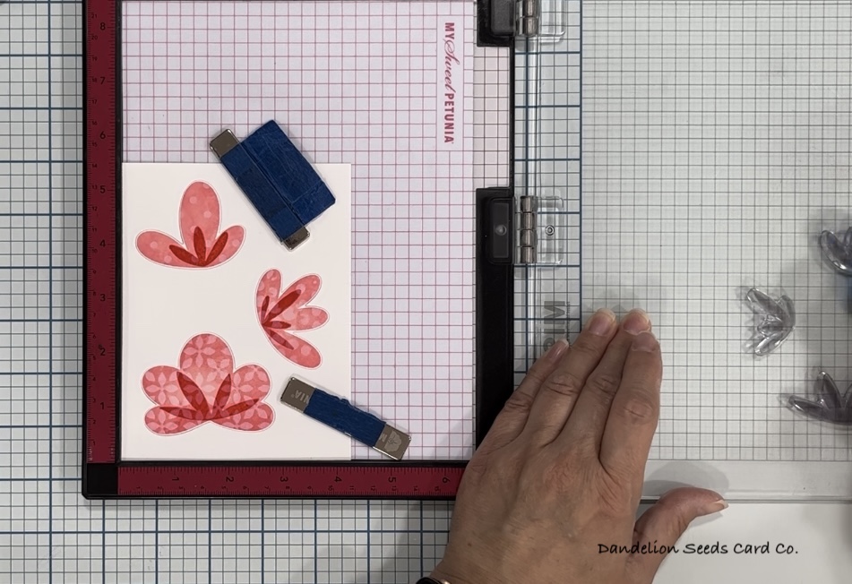
The Flowers:
For this card, I used the Pinkfresh Studio Simple Blossoms stamp set and coordinating dies. It is one of my all-time favorite products, but unfortunately, it seems like it might be retired.
Using Gina K Light Carnation ink, I stamped the largest three flowers onto white card stock. Then, I lightly dusted the edges of each stamp with Medium Carnation and stamped again. This adds a bit of shadowing and helps create dimension.
Now, it's time for the stenciling technique.
I used two different Tim Holtz / Stampers Anonymous mixed media sets to create the patterns on these three flowers. On the larger two flowers, I used Window Watercolor, Nordi and Polkadot, and on the smaller flower, I used Fall Blueprints, Linen and Bubble.

I pretty much followed the technique just as Jennifer shows it in the video. After stamping the flowers in Carnation ink, I cleaned the stamps and laid the stencil over the stamp. I inked through the stencil with Hero Arts Unicorn White pigment ink, removed the stencil, and stamped the dots down onto the flower. I repeated this 2-3 times to make the white flowers brighter. I did the same step for each of the three flowers, just with different stencils.
I die cut the three flowers using the coordinating dies.
The Stems & Background:
Working on a white A2 card base, I laid out the flowers temporarily and found the right position for the greenery. (I used an acetate grid transparency to hold the wiggly stems in place!)

Then, I removed the transparency & the flowers and stamped the stems, sepal, and leaves in Gina K Light Spruce ink. I attempted to add shadowing by dusting the edges of the leaf and sepal stamps with Medium Spruce ink. It somewhat worked on the leaves, but the sepal was just too tiny, and it pretty much ended up all being dark.
As I was putting away the greenery stamps, I noticed the detail stamp for the leaves. I should have left it alone, but I sometimes don't know when to quit. I lined up this stamp (not perfectly, as you can see) and then stamped it with Gina K Dark Spruce.

Too much. It was so dark! I should have opted for a tone-on-tone look and used Medium Spruce. Well, at this point I was not about to quit, so I convinced myself it wasn't as bad as it looked.
Using Simon Says Stamp Fog ink, I stamped the Hero Arts Script Bold Prints stamp on the background. I concentrated the ink in the center of the stamp and used a cloth to soften the edges a little. This was mildly successful.
Oops...
It's at this point I realize each of these flowers is supposed to have a center. I thought about skipping it because I seriously did not want to mess this up at this point. I had no idea what would happen if I stamped over the white pigment ink. Would it even show up? In retrospect, I probably should have heat set the white, but I didn't.

To hold the die cuts for repeated stamping in my MISTI stamp positioner, I used the negative (trash) from the flower die cutting. I flipped it upside down and used low-tack tape to adhere the flowers back into the holes they'd come out of. This would hold them still in the event I needed to stamp multiple times.
After the Dark Spruce Debacle, I got a little wiser with the ink color. I positioned the flower centers and stamped them with Medium Carnation ink. Once. Twice. It just was not showing up much. Still hesitating, I grabbed my Gina K Dark Carnation ink and stamped each of the flower centers. One and done. Success.
Building the Card:
I repositioned the flowers above their sepals and glued them down with varying levels of dimension. The largest flower is glued down individually, the medium flower has two more white diecuts behind it, and the smallest flower has three diecuts behind it. For the smallest flower, I trimmed away the extra diecuts where they overlap the medium-sized flower.
My goal with the sentiment was to find something small and cute enough to be feminine yet large and bold enough to cover up those ugly green stripes on the leaves. I tried sooo many sentiments and none were right. Adding the sentiment at the bottom looked out of place, and quite frankly, placing the sentiment at the ugliest point on the card just drew attention to it.

I finally chose to put the sentiment at the top of the card, near the pretty flowers. Perhaps a bright gold sentiment, placed as far from the ugly green stripes as possible, would adequately distract the viewer.
I cut the Simon Says Stamp Bold Hello twice from white card stock and once from Tonic Studios Polished Gold Mirror card stock, and then stacked these for dimension. To continue drawing the eye up, up, and away, I added a diagonal line of Spellbinders Gold Smooth Discs.
Repairing the Damage:
At this point, I thought the card was done. As I was cleaning up the craftermath, an idea came to me out of nowhere! What if I inked blended in white over the Dark Spruce stem stripes?! That could solve two problems! It could help soften the edges of the Script stamp, which I had attempted, with moderate success, to do when I stamped it the first time. And more importantly, it would soften the ugly stripes.
Now, let me state the obvious: This is a bold, stupid move. This card is finished, and there's nothing wrong with it. Sure, the stem stripes are a little obnoxious. But it's DONE. It's a CARD. And I was about to risk it all.
So, I grabbed my blending brush that's designated only for white pigment ink, and I just did it! I blended all the way around the card, avoiding the flowers and sentiment, but blending heavily around the bottom and up to the striped leaves.
And I'm happy to report, the risk paid off! The stripes are still visible, but they are maybe half as dark as they were. Yeah, they were that bad.

I hope this inspires you to try out an old technique you haven't tried in a while, or maybe haven't ever tried. It might feel a little bit like homework, but sometimes that gives your card making a purpose, a focus. And if you're anything like me, being told what to do gives you one less thing to worry about.
Thanks for stopping by!
Tammy
Tammy
Comments
Post a Comment