Let's just get the disclaimer out of the way: I know nothing about mixed media. Zero. I like the look, but I've never been brave enough to try it. I registered for the Hero Arts Mixed Media Stamp Along that was held last weekend, but then I got called away for family things, and I didn't get to participate. Well, that's not completely true. I did watch the welcome video and about half of the first class. Still, I have no idea what I'm doing. Nonetheless, I'm willing to share my blind attempt with you.
Mixed Media is ANYTHING Mixed!
If there's one thing I took away from the Stamp Along welcome video, it's that mixed media really is anything that combines multiple types of mediums. So, if you use embossing powder, watercolor, and Copic markers together, you have just created mixed media art.
And maybe the best part -- There don't seem to be any rules. We all know the regular card making rules: triangles, rules of three, color combos, and more! No rules?! I was about to find out whether this freedom from rules is a blessing or a crippling curse.
Medium #1:
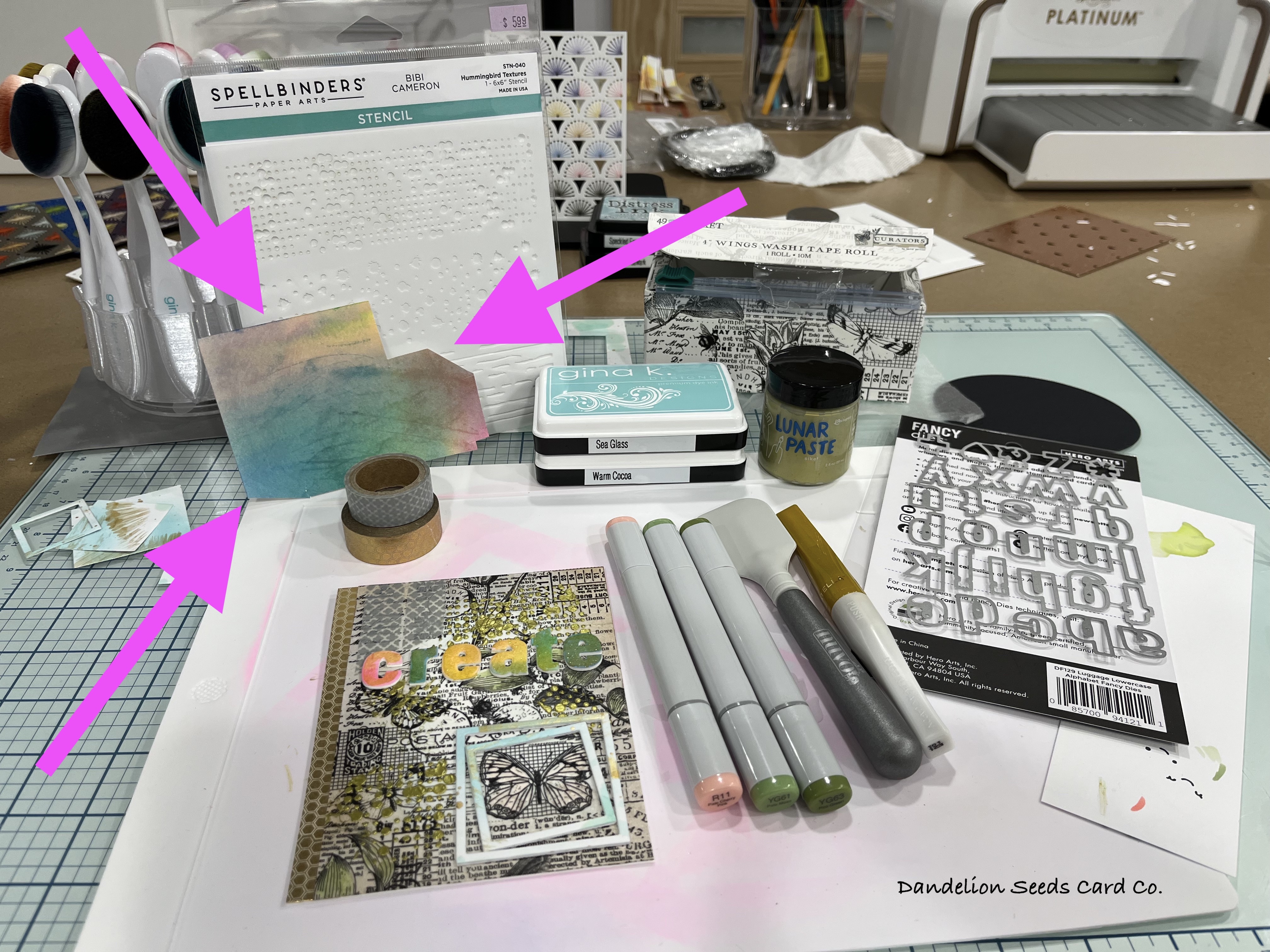
The 4" wide roll of Wings washi tape from 49 & Market was the starting point for this project. I tore off a 6" length and crumpled it up to create texture, just as I had seen a YouTuber do once. I was shocked that I could open the tape back up without ripping it. I repeated this a couple times and then adhered it to a white A2 panel. Now what, right?
Medium #2:
To create a bit of a grungy look, I ink blended around the outside of the panel, first with Gina K Warm Cocoa ink and then with Gina K Sea Glass ink. This pool-colored ink choice will hopefully make sense later on. Medium #3:
To create texture, I used the Spellbinders Hummingbird Textures stencil, and Sike! Lunar Paste that I didn't even remember I owned. (Seriously, the amount of unopened, unused, forgotten product I own is astounding.) I just held the stencil in place and applied paste with a Tonic Media Spatula, being careful not to get good coverage. Then, I moved the stencil to a new spot and repeated -- four spots total. FYI -- Stop. Touching. Things. This Lunar Paste takes a relatively long time to dry! I tested it a few times, and thank goodness this is supposed to look a little grungy because I smeared the paste every time.
Medium #4:
Now, on the little bit of the Stamp Along I watched, one of the speakers mentioned three as, perhaps, a target they keep in mind for the number of mediums they use in mixed media projects. If I'm already at four, I must be rocking this.
I used Copic markers -- YG61 & YG63 -- to color in the leaves. I definitely should have done this before adding the Lunar Paste, but since full coverage coloring didn't matter that much, I just kept the marker tip away from the paste. I also learned that washi tape doesn't play that well with alcohol markers. The tape bubbled up a bit when I colored over it to blend my two markers together. This wasn't really noticeable since I had already added texture when I crumpled up the tape.
 |
So much mileage out of this scrap of test paper!
|
To accent one butterfly, I decided to frame it. Laying on my desk was one piece of scrap paper that I had been testing paint splatters and ink and embossing folders on. I had already die cut windows out of it as test windows for this card. Luckily, the test colors would work with the Lunar Paste and Sea Glass ink I had already used. I layered up the tiny frames and added them around the butterfly. I would have preferred for the smaller frame to sit a little on top of the larger frame, but with the added layers, they just wouldn't lay right, and I was not about to risk experimental die cut surgery at this point. I colored the butterfly with Copic marker R11, and to avoid bubbling the tape, I didn't try to blend in another color.
Medium #5:
For the sentiment, I turned to the ugliest piece of paper in my craft room. It appears I tried to watercolor this piece of paper, but I have no idea what the weird charcoal-colored slash marks are on it! What's more, I have no idea why I have kept it and shuffled it around for all these years. Apparently, just for this moment...
Using the Hero Arts Luggage Lowercase Alphabet Fancy Dies, I cut the letters for create out of white paper three times and then cut them once out of the ugly watercolor paper. I stacked these up for dimension and then colored them with a gold glitter Wink of Stella pen. I glued these across the panel, centering them on the washi tape. Finishing Up:
Since the washi tape is only 4" wide, I needed to fill the extra space on an A2 card base. Sticking with the gold theme, I ran a piece of honeycomb washi tape down the left side of my card base. The 49 & Market washi tape has a couple bees on it, so the honeycomb made perfect sense!
After I added the mixed media panel to the card base, I decided the top, left looked a little bare. To fill in that space, I added a couple pieces of gray washi with quatrefoils on it. I tore these on the bottom edge to keep with the somewhat grungy look I hoped I was creating.
Bonus Cards:
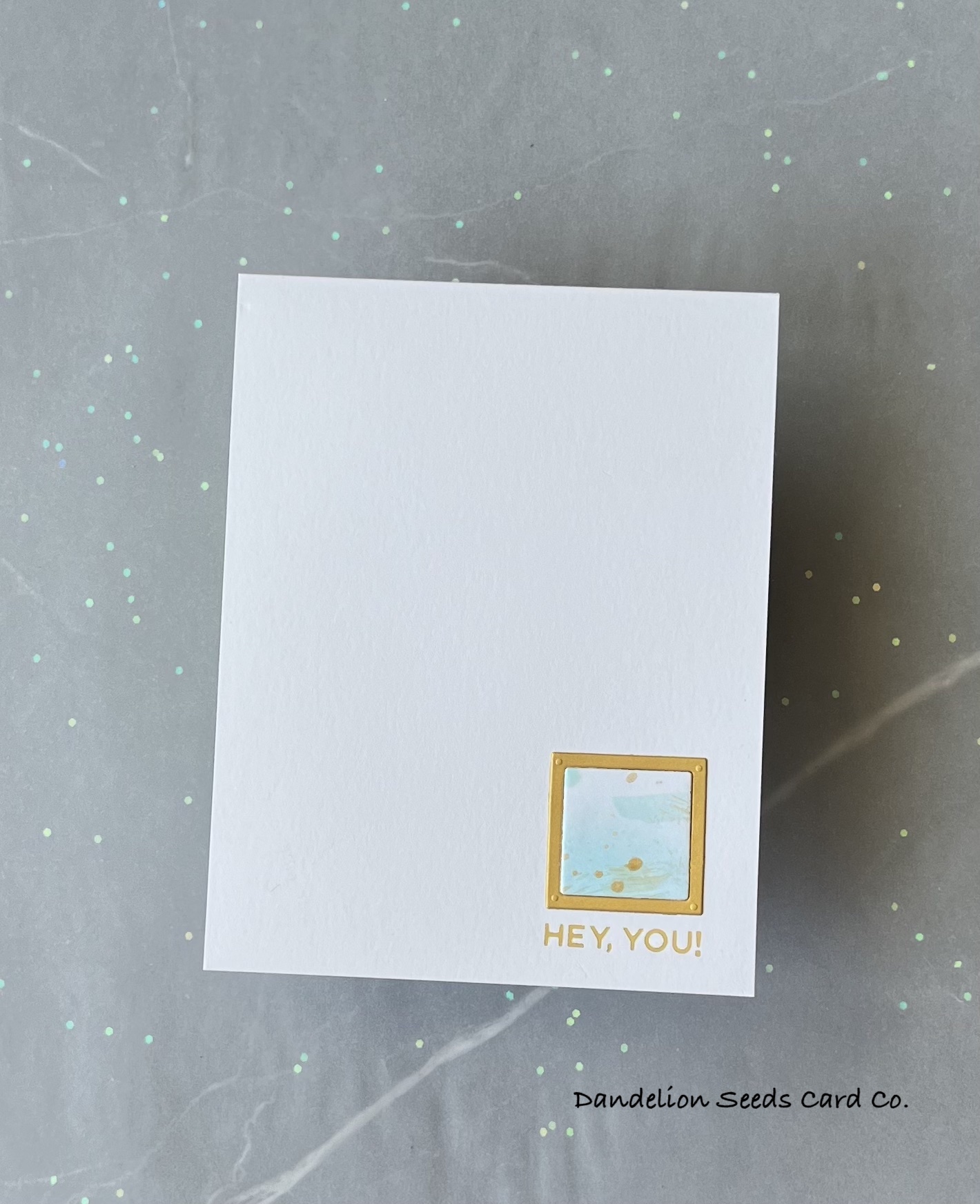
As I cleaned up the mixed media craftermath, I couldn't help noticing how fun and funky my ink blended, gold smeared test windows were. I was inspired to create something I once saw called (maybe?) inchies -- which are 1" squares of paper that are the focal point of a card.
For these three cards, I foiled three different sentiments from the Spellbinders More Sentiments set, using Glimmer Matte Gold foil. I used the (retired?) Sizzix Square Frame dies to cut a frame from Spellbinders Brushed Gold card stock. I layered up my tiny test windows to add just a bit of dimension. And that was it. It's a little funny that I created one grungy mixed media card and three very clean and simple cards using that one piece of test paper.
Mixed Media: Blessing or Crippling Curse?
I have zero idea if I did mixed media right. I mean, I used more than three mediums, so that's something. I obviously have a lot to learn, but I do love the freedom of not worrying so much about perfection. Smeared paste? No problem. Bubbling paper? Nice texture. Ugly mess ups? That works, too!
For sure, I need to watch the Hero Arts Stamp Along videos and then try mixed media again! But for going into this blindly, it turned out all right!
Thanks for stopping by!
Tammy


Comments
Post a Comment