Hello, hello! I am super excited to be sharing this card! It is so incredibly unlike anything I have ever created, which was all at once invigorating and frightening!
So, let's get into it!

The Inspiration:
One of the cards the instructor created in this class used a galaxy sky background, but instead of actually using it as a galaxy sky, the panel was cut down with a die to be something completely not a sky.
I wanted to use the galaxy idea, but put my own spin on it. Lucky for me, one of the <ahem> four layering stamp sets I own is the Altenew Mini Moon set. This would be perfect for a galaxy sky!
Stamping & Masking:
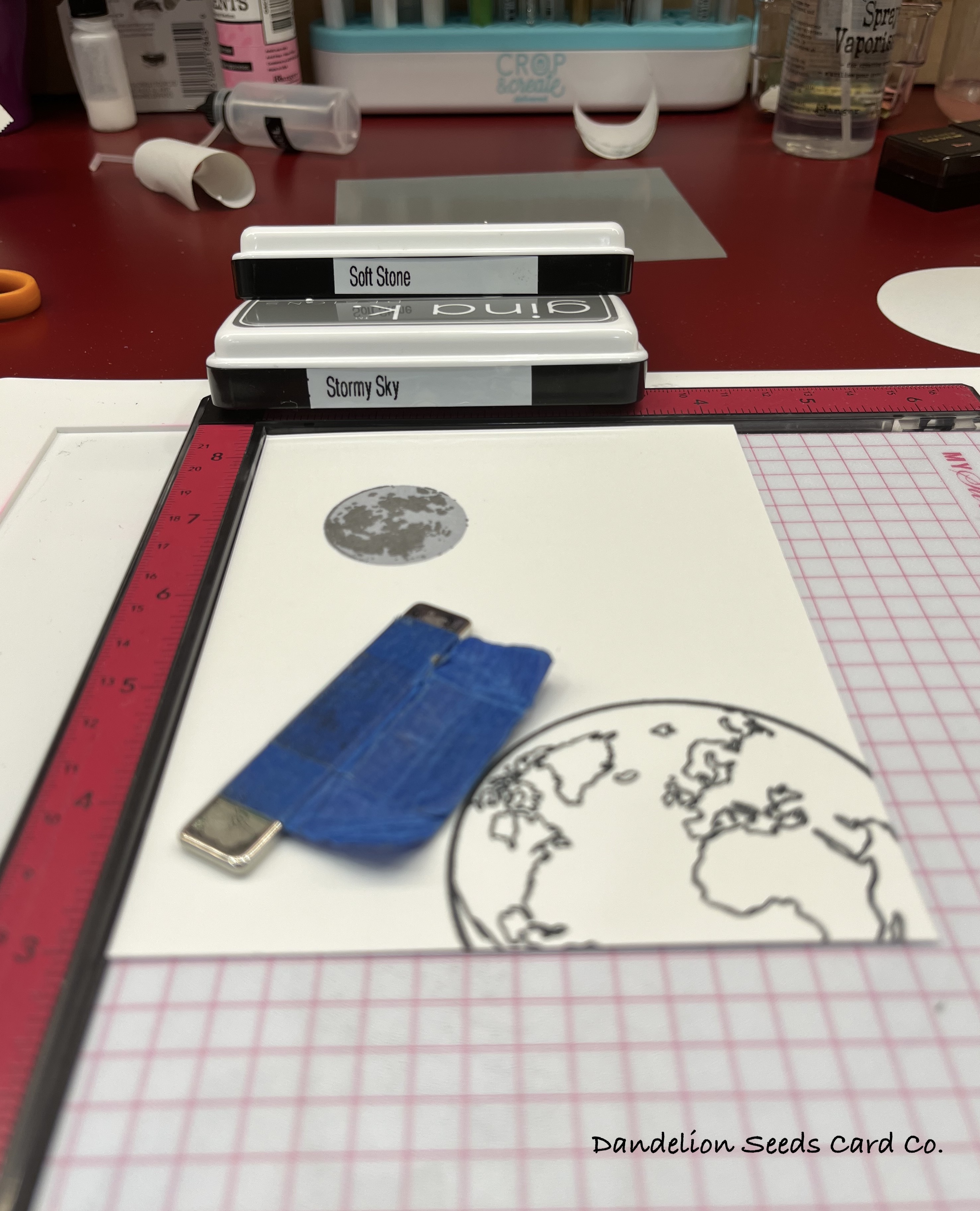
I stamped the Mini Moon in the northern sky, using Gina K Soft Stone and Stormy Sky inks. I had hoped to create a mask for it using one of the Hero Arts Nesting Circle Infinity dies, but there wasn't one the right size, so I was forced to fussy cut. Ugh! (This explains the flat surface on the northeast side of my moon!) I used Gina K Masking Magic for the mask.

I stamped the earth image from the (retired?) Gina K Wonderful World set in the lower, right corner, using Memento Tuxedo Black ink, which is Copic friendly. I colored the earth using G24 & G46 for the land, and B02, B04, and B05 for the water. This circle is a perfect match for one of the Hero Arts Nesting Circle Infinity dies, so I die cut a mask for it out of Gina K Masking Magic.
The Ink Blending:
It's at this point in the process, I know I am completely like a fish out of water. The chances of me messing this up are beyond likely, but I persevered and tried to trust the process.

I chose mostly Distress Inks because I trusted them to be good for ink blending techniques, and I figured they'd give me the best chance at success. I began with the lightest color, Squeezed Lemonade, in the center of the panel. I colored a pretty big area and then moved on to the Salty Ocean.
Next, I added some Altenew Crimson because I figured it was the least sky-like color, and I wanted to get that down before I added in the blue and purple. After adding Dusty Concord and Prize Ribbon, I started going back over the other colors to blend them.
Before I finally slapped my hand away, I had almost blended all the colors into one blobby, ugly mess. Honestly, I figured it was ruined at this point, but I just kept going, thinking it would be good practice for when I started over.
Next, I blended Gina K Black Onyx ink around all the edges, using a heavier hand right at the edges, and getting a little lighter toward the middle. I had no idea how far into the panel to go, so I just guessed at what might work.
The Splattering Nightmare:
With the splatters, I was hoping for a romantic starry sky. What I ended up with was a meteor shower! But again, I just kept going. Practice card, right?

I first splattered Picket Fence Distress Paint, using a wide fan brush. Interestingly, this paint seemed to pick up the rainbow of color underneath it and turn a bit purpley. You can especially see that in the shooting stars just above Earth.
After the Distress Paint dried, I splattered on some seriously ancient Apple Barrel gold paint. This is when the meteor shower showed up out of nowhere.
Again, I just kept going. Trust the process. Let this be a practice card.
The Reveal:
When the paint was dry, I pulled away the two masks, and I began to wonder if the card was ruined after all. The rainbow of color in the center of the card was rather Northern Lights-ish, and maybe the shooting stars really were shooting stars and not paint splatters gone awry.
Keep going. Trust the process. Practice card (or maybe not).

For the greeting, I stamped the sentiment from the Mini Moon set onto Hero Arts Pitch Black card stock, using Versamark ink, and then heat embossed with Hero Arts Fine Detail White embossing powder. I used a fishtail banner die from my stash to trim out the sentiment strip. I stacked 2-3 more black banners behind the sentiment for added dimension. I mounted the completed panel onto a Pitch Black A2 card base.
The Lesson Here?
Even when you think all is lost, just keep going. Sure, this is card-related, but also in life. You can't quit just because you've made a hot mess of things. Figure out how to save the day. Who knows, maybe the meteor shower you've created will turn out to be a thing of beauty in the end. Mine did.
Thanks for stopping by!
Tammy
Tammy
You are such a hoot! I am having so much fun reading your posts! Your card looks RAD!
ReplyDeleteThank you! I'm glad I was able to capture this inky adventure on the page.
ReplyDelete