This is a safe space, so let's be honest here.
.jpg)
Using a Tim Holtz brayer -- the best for this technique -- I inked up the smooth side of the embossing folder with Gina K Bubblegum ink. I placed an A2 panel of Taylored Expressions Guava cardstock on the raised side of the folder, carefully closed the folder, and ran it through my die cutting machine. And then I repeated.
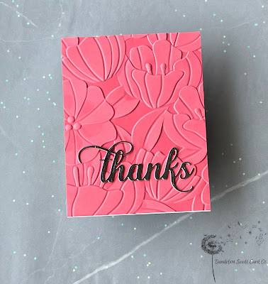

I die cut the Altenew Fancy Thanks die -- one of my most used dies -- once from metallic cardstock and twice from TE Guava, stacked them up for dimension, and then adhered the sentiment near the bottom right of the panel.

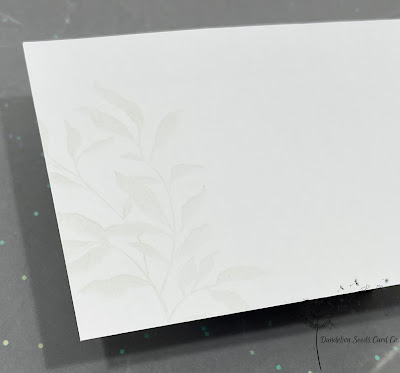
The envelope for this card might just be my favorite envelope ever! I stamped one of the images from the Leaf Clusters set, using Taylored Expressions Sea Salt ink. The barely there image is perfectly subtle!

Thanks for stopping by!
Tammy
After completing my first AECP course in die cutting, I needed to choose a second course. I perused the titles and was intrigued by this course in "boutique cards" because I had no idea what that meant.
According to Merriam-Webster:
bou-tique (n) - a small shop dealing in fashionable clothing or accessories
Well, yes, but what do boutique cards look like?
In the Altenew world, boutique means simple, striking, polished, and professional.
Yep. That's my look! Count me in!
In this course, I was inspired to use basic stamping techniques, watercolor, metallic finishes, texture, and more! And while this may sound like you're creating cards with lots of fussing and futzing, you're not! For this course, I completed six clean and simple cards with matching envelopes; here, I'm sharing my favorite two.
Technique: Faux Letterpress / Embossing
I have had this Altenew Flowers and Leaves 3D embossing folder in my stash forever, and I love it, but I've just never been able to get it quite right -- mostly because I can't leave things well enough alone. Well, that (minor) flaw of mine stopped here.
.jpg)
Once. Twice. Three times. Maybe more. Until the ink had transferred well and created a rich contrast between the flowers and the background.
And then I did what I never do. I left it alone. That, my friends, was the winning move.

Tip: On subsequent passes through the machine, be sure the panel is seated into position, so you are always embossing in the exact same location. You'll feel it sort of "snap" into place.

Since the embossing folder pattern definitely has a right-side-up, embossing the envelope flap was a bit of a magic trick. I discovered that I could use an open embossing folder and a partial die cutting technique. (Did I just invent something?) Here's a video to show how this works:
Technique: Luxury Papers
For this technique, the challenge was to incorporate some sort of fancy paper: vellum, foil or metallic card stock, fabric or wood papers, or acetate. Well, after my embossing folder win, I was feeling pretty confident, so I figured I'd try out something else I never get right: clear acetate cards. I mean, I understand the concept, but I've never been happy with the results.

I chose two inky watercolor backgrounds from my Someday Card Parts Pile and die cut three different leaves from the Altenew Leaf Clusters set. I cut additional leaves from inexpensive white cardstock and then glued together a pretty one and a plain one for added stability and dimension.
Now, at this point, I could try to convince you that I haphazardly glued these onto the acetate and created a stunning layout. Yeah, right. It's safe to say I fussed with these leaves for at least an hour before I finally settled on this arrangement and glued them down.
Tip: Use a strong liquid adhesive VERY sparingly or else the glue will seep out onto the acetate. (Ask me how I know.) When that happens, 91% rubbing alcohol will remove the glue. And then you can start over. Again.

For a sentiment, I added the LDRS Creative Just a Note die cut to the front -- only gluing where the circle would touch the leaves. I lined up an additional circle, directly behind the one on the front, and glued it inside as a place to write a personal message. And since I had one tiny leaf left, I put it inside, too!


And this, my friends, was my first ever acetate card win!
I hope this inspires you to try out some techniques that have been challenging for you! You just might surprise yourself!
Thanks for stopping by!
Tammy
Absolutely amazing work, Tammy!
ReplyDeleteThank you so much!
Delete